What Is Affinity Mapping?
Affinity mapping—also known as affinity diagramming—is a powerful technique for synthesizing large volumes of qualitative data into actionable insights. Used in UX research, design thinking, agile retrospectives, and customer feedback analysis, this method transforms sticky notes and scattered ideas into structured themes that fuel innovation.
By grouping observations, an affinity diagram helps teams extract insights and identify patterns in qualitative data. Basic affinity mapping delivers clarity, while advanced affinity mapping techniques transform this clarity into a strategic insight engine.
Core Steps in the Affinity Mapping Process
The classic affinity mapping process follows four core steps:
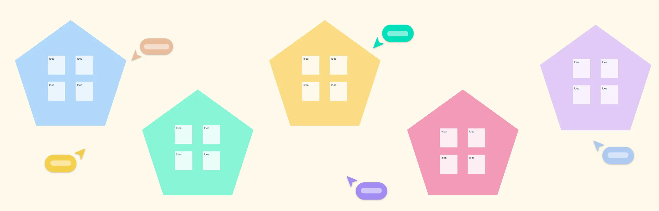
- Generate Notes: Capture data points on sticky notes or digital cards.
- Group by Similarity: Cluster related notes to form initial themes.
- Label Clusters: Assign concise headings to each group.
- Extract Insights: Analyze themes to guide strategic decisions.
Before mapping, clarify objectives, define the scope, and establish any preliminary categories. This preparation aligns the team and sets boundaries for effective clustering. As themes emerge, refine clusters through iterative passes—moving notes, merging groups, and revisiting labels. Iterative refinement ensures that the affinity mapping process adapts to new insights rather than locking in early assumptions.
Technique 1: AI-Assisted Clustering on a Digital Canvas
AI-assisted clustering accelerates traditional affinity mapping techniques by suggesting initial groupings based on natural language patterns. Creately’s AI-powered Visual Intelligence analyzes note content and proposes thematic clusters in seconds. This capability allows teams to tackle large-scale datasets without manual exhaustion.
- Automatic Theme Suggestions: AI identifies semantic similarities across notes.
- Scalability: Handles hundreds of notes, reducing initial grouping time.
- Outlier Detection: Flags notes that don’t fit existing clusters.
Best practices:
- Review AI-generated clusters critically and adjust labels to preserve context.
- Merge or split clusters manually when themes overlap or diverge.
- Validate AI suggestions with subject-matter experts to ensure accuracy.


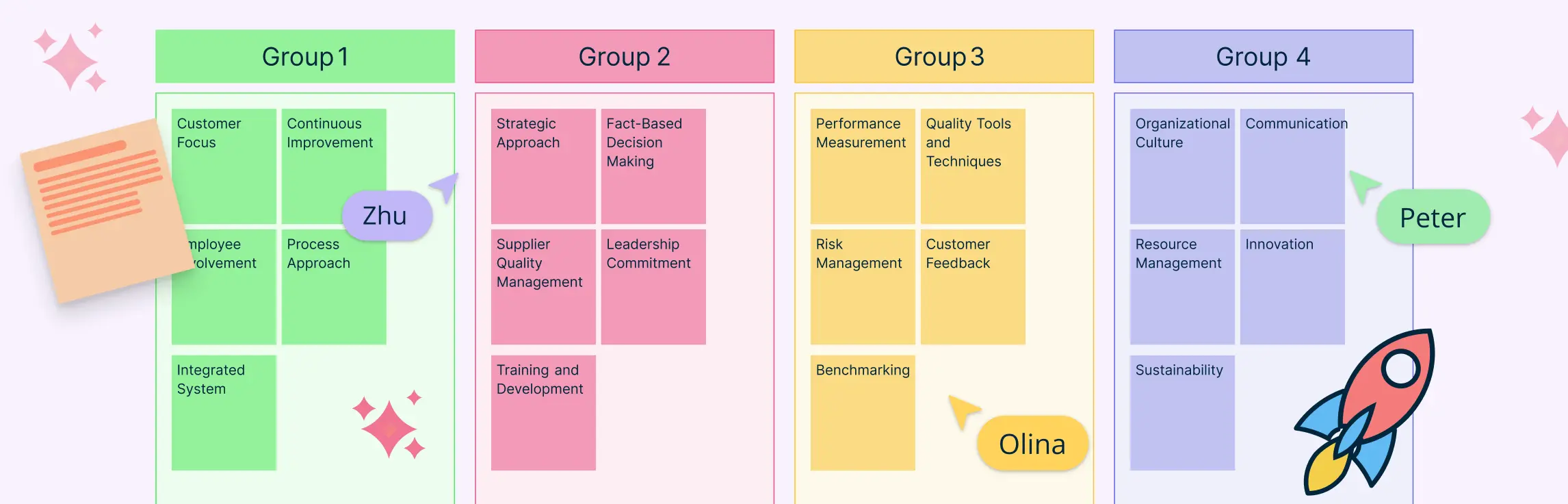
Technique 2: Multi-Dimensional Tagging and Filtering
Multi-dimensional tagging extends basic affinity mapping by assigning custom property tags—such as sentiment, user persona, or priority—to each note, enabling teams to slice and dice clusters by multiple dimensions.
- Custom Properties: Add fields for sentiment scores, user roles, or feature requests.
- Color-Coded Views: Apply color highlights to tags for visual distinction.
- Dynamic Filters: Show or hide notes based on tag combinations.
This approach reveals cross-sectional patterns, such as high-priority negative feedback from a specific persona. For example, segmenting customer feedback by feature request and sentiment helps product managers prioritize improvements.
To ensure consistency, standardize your tag taxonomy across large teams and document tag definitions in a shared guideline.This multi-dimensional analysis takes affinity mapping techniques further, uncovering hidden connections that inform targeted actions.

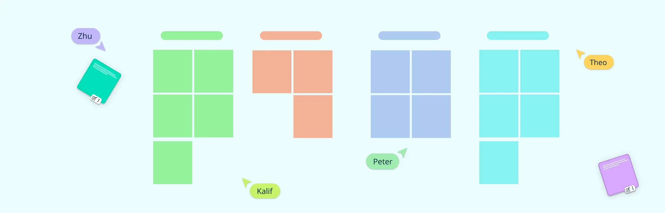
Technique 3: Matrix Mapping for Prioritization
Matrix mapping transforms qualitative insights into actionable priorities by placing clusters onto a two-axis grid—commonly impact vs. effort or frequency vs. importance. Teams quickly identify high-value areas in the resulting quadrants.
- Two-Axis Grid: Define X and Y axes based on prioritization criteria.
- Quadrant Placement: Position thematic groups within quadrants to highlight strategic focus.
- Visual Clarity: Use Creately’s grid and alignment tools for precise layout.
By mapping clusters visually, teams decide which themes warrant immediate attention. For instance, prioritizing feature ideas from user interviews helps direct the product backlog.
Matrix mapping bridges the gap between qualitative findings and strategic planning. It makes the affinity mapping process an integral part of decision-making, shifting raw clusters into a prioritized roadmap.
Teams using matrix mapping report faster consensus and clearer rationale for choosing high-impact initiatives. This technique ensures that affinity mapping techniques drive measurable business outcomes rather than remaining an abstract exercise.

Technique 4: Visual Heatmaps and Pattern Overlay
Visual heatmaps add an intuitive layer to affinity mapping by overlaying color gradients on clusters to indicate density or concentration. This pattern overlay highlights hotspots and outliers at a glance.
- Density Visualization: Apply color scales to show cluster sizes.
- Overlay Effects: Use shape formatting and layering in Creately to create heatmap visuals.
- Quick Insights: Identify major themes and gaps in coverage.
Heatmaps help balance focus across research topics by revealing where clusters are overcrowded or sparse. For example, mapping support tickets with a heatmap uncovers the most frequent pain points. Teams use this insight to allocate resources and plan targeted follow-up research.
By integrating visual heatmaps into the affinity mapping process, practitioners gain an at-a-glance view of core themes and outliers. This technique elevates traditional clustering into an analytical tool that guides resource allocation and strategic planning.

Technique 5: Hierarchical Grouping with Roof Analysis
Hierarchical grouping—also known as roof analysis—organizes data across multiple levels, starting with broad, high-level clusters (the “roof”) and drilling down into sub-themes. This method preserves granularity while exposing big-picture structure.
- Top-Level Clusters: Establish umbrella categories first.
- Indented Lists: Create tree diagrams in Creately to visualize sub-category relationships.
- Roof Visualization: Use shapes and connectors to show hierarchy.
This approach clarifies how main themes relate and how sub-themes fit within each category. For example, breaking down “usability issues” into navigation, performance, and design sub-issues helps teams target specific areas. Hierarchical grouping maintains context for each data point, reducing the risk of losing nuance during large-scale affinity mapping.
By applying roof analysis to the affinity mapping process, teams benefit from a multi-tiered view of insights. It ensures that strategic planning incorporates both the overarching vision and detailed action items derived from user research.

From Affinity Mapping to Action: Planning Next Steps
Transforming clusters into executable deliverables ensures that insights drive outcomes.
- Deliverable Translation: Convert clusters into personas, user stories, or backlog items.
- Ownership Assignment: Use swimlanes or Kanban views to assign tasks and deadlines on the canvas.
- Presentation Mode: Export findings for stakeholder alignment in a few clicks.
- Follow-Up Workshops: Schedule sessions to validate insights and refine action plans.
- Data Linking: Connect clusters to Jira, Confluence, or other systems for continuous updates.
By embedding planning directly into the affinity mapping process, teams maintain momentum and accountability. This integrated approach ensures that affinity mapping techniques translate into measurable progress and aligned outcomes.
Resources:
Lucero, A. (2015). Using Affinity Diagrams to Evaluate Interactive Prototypes. Human-Computer Interaction – INTERACT 2015, 9297, pp.231–248. doi:https://doi.org/10.1007/978-3-319-22668-2_19.
Widjaja, W. and Takahashi, M. (2016). Distributed interface for group affinity-diagram brainstorming. Concurrent Engineering, 24(4), pp.344–358. doi:https://doi.org/10.1177/1063293x16657860.
FAQ on Affinity Mapping Techniques
What are the dos and don’ts of affinity mapping?
Dos:
- Involve diverse team members for broader perspectives.
- Use clear, concise phrasing for each idea.
- Iterate clusters as new themes emerge.
- Document tag definitions if using custom properties.
Don’ts:
- Overcluster—forcing unrelated ideas into a single group.
- Ignore outliers—they can reveal critical edge cases.
- Skip the analysis phase—insights come after clustering.