Affinity mapping in UX brings structure to qualitative research, transforming raw observations into cohesive themes. It fuels actionable insights by clustering related observations, ideas, or pain points. This guide walks through core concepts, workflows, and tools, from basic affinity diagram UX to best practices.
What Is Affinity Mapping in UX?
Affinity mapping in UX is the process of organizing qualitative data—such as user quotes, survey responses, and design ideas—into thematic clusters to uncover patterns and insights. Rooted in the KJ Method developed by Jiro Kawakita, this technique is widely used during research synthesis and ideation sessions to highlight user motivations, pain points, and emerging themes. By visually grouping related data, UX teams gain clarity on recurring issues, unexpected insights, and design opportunities. The collaborative and transparent nature of affinity mapping fosters team alignment and helps ensure that design decisions are grounded in real user needs.
Why Use Affinity Mapping for UX Research and Design?
Affinity mapping UX transforms scattered qualitative data into actionable insights. By visualizing clusters of related observations, teams accelerate research synthesis, streamline ideation, and improve design decisions. Below are core benefits that highlight why affinity mapping is essential in UX research and design.
Synthesizes a large number of data points
It synthesizes hundreds of user interviews, survey responses, and usability test findings into clear, prioritized themes. Visual clusters reveal user pain points, feature requests, and emotional motivators, guiding the product roadmap.
Team alignment
By mapping related observations side by side, teams align on critical insights faster. Consensus on thematic clusters reduces debates about priorities and fosters shared ownership of design decisions across researchers, designers, and product managers, especially using a digital affinity diagram for seamless collaboration.
Accelerates ideation
Affinity mapping accelerates ideation by grouping feature ideas and design concepts into coherent categories. Clusters spark creative discussions, uncover niche opportunities, and focus brainstorming on user-driven requirements, leading to more robust, user-centric solutions.
Prioritize based on relevance & importance
Teams prioritize clusters based on impact, effort, or frequency. This structured approach improves decision-making speed and clarity, ensuring design roadmaps reflect genuine user needs rather than assumptions.
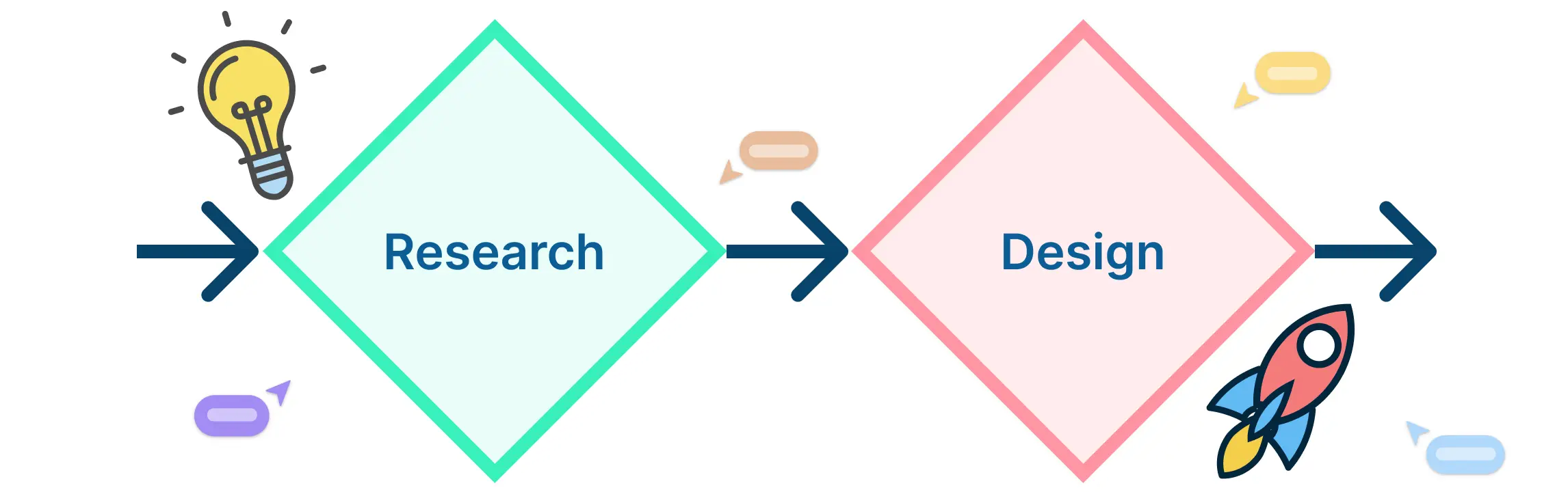
4 Steps to Create an Affinity Map in UX
Follow this four-step workflow to master affinity mapping in UX.
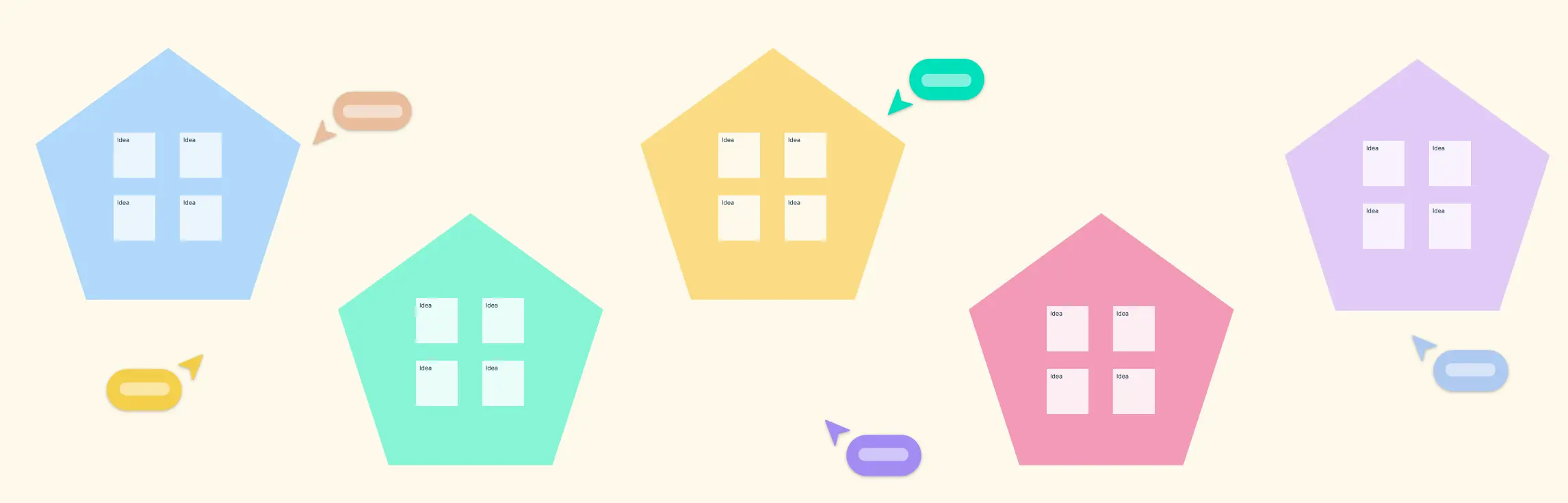
Step 1: Gather and Record Observations as Individual Notes
- Collect user research data—interview quotes, survey feedback, usability test findings—on separate sticky notes or digital cards. A thorough capture phase ensures no insight is lost.
- Aim for one idea per note. Encourage participants to write legibly and include context tags, like source and date.
- In Creately, use customizable templates to record notes with attached screenshots, links, or metadata fields for richer context.
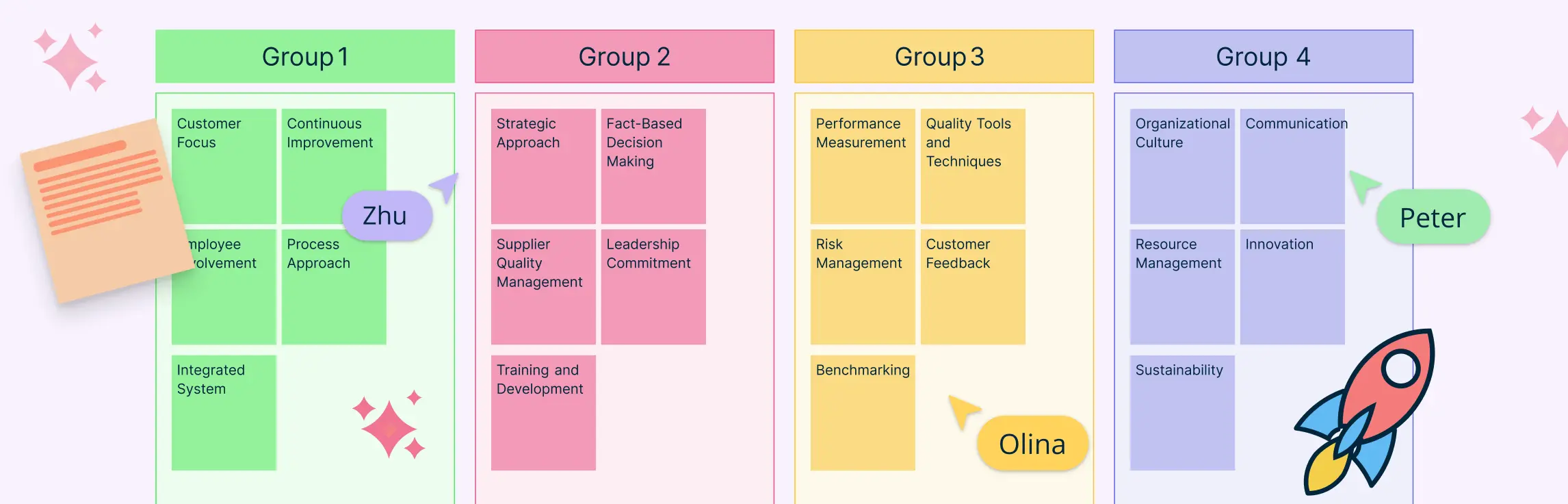
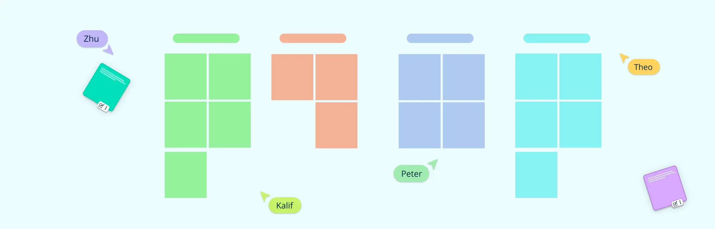
Step 2: Identify Patterns and Start Grouping Similar Notes
- Review all notes collectively. Look for keywords, common problems, or shared sentiments.
- Separate notes into tentative clusters on the canvas. Grouping criteria might include user goals, pain points, or feature requests. Clear criteria accelerate consensus among team members.
- On Creately, you can auto-cluster sticky notes into initial groupings using AI. Adjust clusters manually to reflect nuance.
Step 3: Label Each Cluster with a Clear Thematic Title
- Once clusters form, assign concise, descriptive labels that capture the core theme. Use action-oriented titles like “Onboarding Friction” or “Feature Requests.”
- Encourage participants to propose and debate labels. Well-named clusters streamline analysis and reporting.
- In Creately, you can select text styles and colors to distinguish cluster types for easy reference.
Step 4: Prioritize Clusters and Outline Next Steps
- Rank clusters by impact, effort, or frequency. Use voting methods—dot voting or digital polls—to let the team choose top priorities.
- Review the highest-ranked themes and define action items, such as A/B tests or design iterations.
- In Creately, participants can add reaction emojis or comments.
- Assign tasks, responsibilities, and deadlines directly in the workspace. This final phase ensures that affinity mapping in UX translates into a concrete action backlog.
AI-Powered Affinity Mapping with Creately
The Creately AI Affinity Diagram Template lets UX teams quickly generate affinity diagrams from a prompt or imported data. Creately uses sentiment analysis and keyword similarity to auto-cluster ideas into themes like usability issues or feature requests, saving time and simplifying research synthesis, especially with large datasets.


Tips for Better Affinity Mapping
- Timebox each step to maintain focus.
- Define the grouping criteria upfront to reduce confusion.
- Incorporate dot-voting for democratic prioritization.
- Capture outliers separately to preserve unique insights.
- Encourage diverse perspectives by inviting cross-functional stakeholders, including product, engineering, and design.
Try These Free Affinity Diagram Templates to Get Started
Start with customizable affinity mapping UX templates on an infinite canvas to accelerate setup


Presenting Affinity Maps and Deriving Insights
After completing a UX affinity mapping session, presenting clusters and translating them into actionable outputs is critical. Here’s a quick how-to:
- Story Narrative: Craft a presentation that flows from research objectives to clusters and finally to recommended actions, using slide decks or interactive map exports.
- Visual Highlighting: Emphasize key themes with color-coded frames, icons, and data annotations to draw attention to critical insights.
- Interactive Exports: Share affinity maps as interactive documents or HTML embeds, allowing stakeholders to explore clusters and associated notes directly.
- Stakeholder Workshops: Facilitate validation sessions where participants review clusters, ask questions, and adjust priorities before finalizing the roadmap.
- Action Backlog: Convert top-ranked clusters into epics, user stories, or test plans. Assign owners, deadlines, and success metrics to your development and design pipelines to ensure follow-through.
Best Practices: Dos and Don’ts
Effective affinity mapping sessions rely on clear objectives, diverse input, and a flexible structure. Follow these do’s and don’ts to maximize insight discovery and avoid common pitfalls.
Dos
- Prepare data and set clear objectives: Curate research notes, define session goals, and share context with participants in advance to save time during the workshop.
- Encourage participation from cross-functional stakeholders: Invite designers, researchers, product managers, and engineers to capture diverse perspectives and prevent groupthink.
- Keep clusters concise and mutually exclusive: Use clear labels and avoid overlapping themes to ensure each cluster tells a unique part of the user story.
Don’ts:
- Don’t force items into existing clusters: Allow new themes to emerge organically. If an insight doesn’t fit, create a separate cluster for further review.
- Don’t ignore outlier data: Isolate uncommon observations instead of discarding them. Outliers can reveal breakthrough opportunities or hidden pain points.
- Don’t overcategorize: Limit the number of clusters to maintain focus. Too many categories dilute insights and make prioritization harder.
Incorporate these practices to ensure that affinity mapping UX sessions are productive and actionable. Remember to review and document all clusters, capture outliers, and revisit themes as the project evolves. Using digital tools like Creately further enforces structure, audit trails, and seamless collaboration across teams.
Features and Benefits of Using Creately for Affinity Mapping
Creately enhances affinity mapping UX with advanced visual and collaboration features. Explore how key features and benefits streamline every phase of your affinity mapping workflow.
1. Infinite Canvas with Sticky Notes and Grouping Frames
Creately’s expansive canvas lets teams add unlimited notes, organize clusters with customizable frames, and zoom seamlessly between high-level themes and individual observations. Color-coding and icon libraries maintain visual clarity even on large boards.
2. Real-Time Collaboration
Live cursors, contextual comments, and integrated video calls keep distributed teams in sync. Participants can co-edit maps, react with emojis, and resolve comments inline, enhancing engagement and reducing meeting overhead.
3. AI-Powered Auto-Clustering and Strategic Insights
Creately AI analyzes note content to suggest initial groupings and emerging themes. Auto-clustering accelerates synthesis, while smart recommendations highlight cluster overlaps, potential sub-themes, and priority areas.
4. Embed Research Artifacts and Custom Data Fields
Attach screenshots, user quotes, and metadata directly to notes or clusters. Custom properties like source, priority, and owner ensure each insight includes relevant context, enabling richer analysis.
5. Presentation Mode and Export Options
Share affinity maps as interactive documents or slides. Export to PNG, PDF, or integrate with JIRA and Confluence for seamless handoffs. Also, you can easily create sildes in Creately’s presentation mode. Built-in version history preserves audit trails and simplifies refinement cycles.
6. Customizable Templates for Affinity Mapping
Choose from pre-built affinity mapping templates tailored to UX research synthesis, ideation, or design refinement. Templates accelerate workshop setup and enforce structured workflows.
7. Integration and Interoperability
Seamlessly connect with GitHub, JIRA, and Confluence via two-way sync. Maintain data consistency across tools, reduce manual updates, and streamline handoffs between research and development cycles.
Together, these features empower product managers and UX researchers to transform affinity mapping UX into a strategic, data-driven process.
Resources:
He, Z. and Peng, H. (2023). Research on User Experience Design Based on Affinity Diagram Assisting User Modeling – Taking Music Software as an Example. Lecture notes in computer science, pp.516–526. doi:https://doi.org/10.1007/978-3-031-35699-5_37.