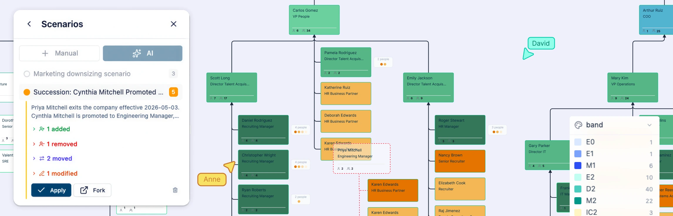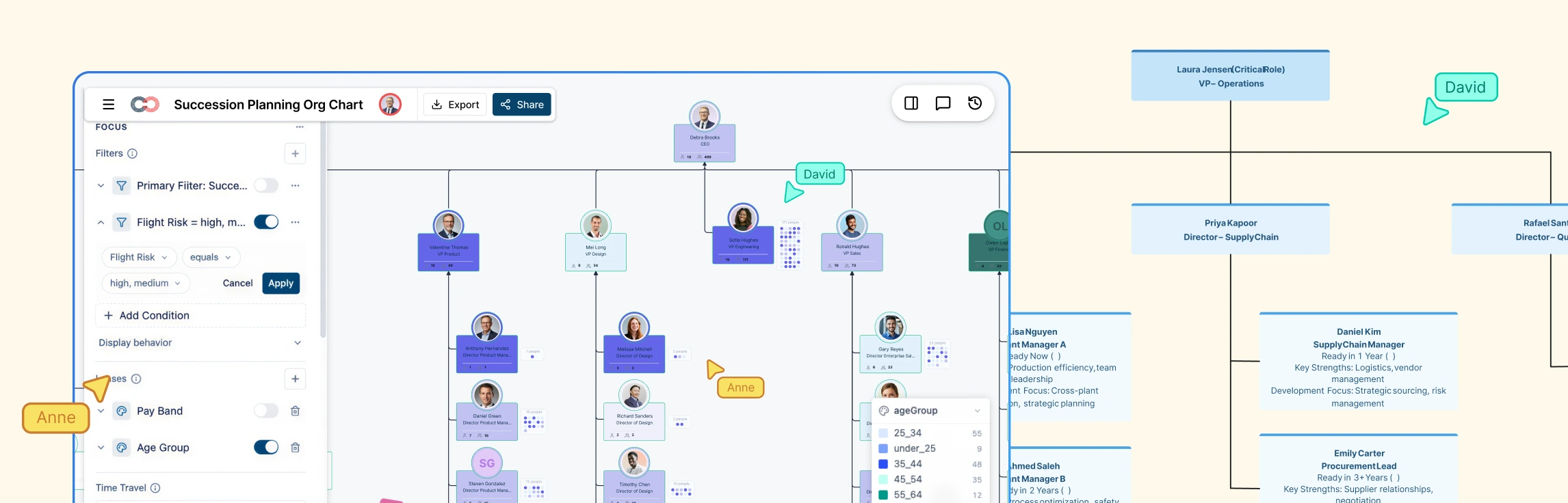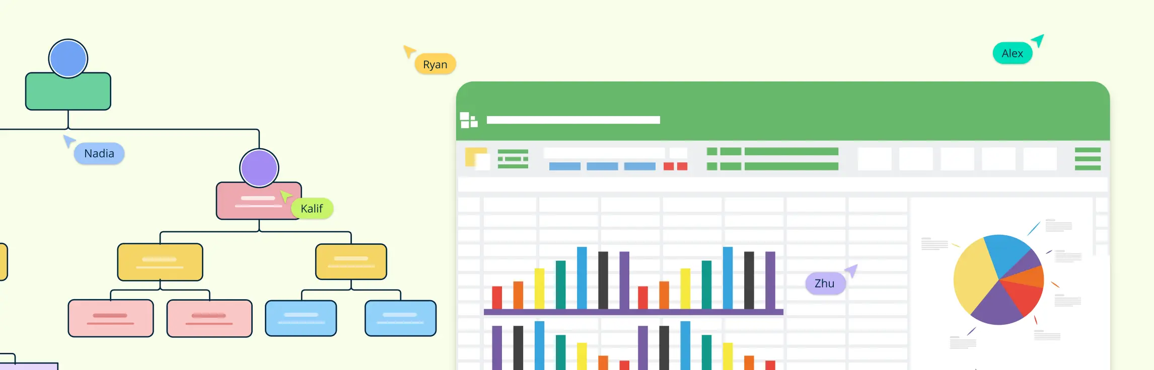
To generate an org chart from a spreadsheet, start with a clean list of employee names, titles, and reporting lines. Then import that table into a tool that can visualize the hierarchy, check the structure for mismatches, and adjust the layout for clarity. This guide compares common spreadsheet-based methods and explains when a dedicated org chart software tool helps teams validate imported records, organize employee fields, and review proposed reporting changes.
How to Generate an Org Chart from a Spreadsheet
Follow these steps to create an organizational chart from spreadsheet data using Microsoft Excel, Google Sheets, Apple Numbers, or a dedicated diagramming tool.
Before you begin, make sure your spreadsheet includes:
- One row per employee with a stable, unique employee ID
- A consistent manager field for reporting relationships
- Clean names and titles with no duplicate records
- Optional columns like department, location, headshot, vacancy state, or start date if you want richer employee cards and cleaner workforce-planning views
Step 1: Prepare Your Data in a Spreadsheet
The first step in creating an organizational chart from a spreadsheet is ensuring your data is well-organized. You will need to structure your spreadsheet with the following columns:
- Name: The name of the individual.
- Role/Title: The person’s job title or role.
- Manager: The name of the individual they report to.
Example:
| Employee ID | Name | Title | Manager ID | Department | Location |
|---|---|---|---|---|---|
| E001 | John Smith | CEO | Executive | New York | |
| E002 | Jane Doe | COO | E001 | Operations | New York |
| E003 | Tom Harris | Operations Manager | E002 | Operations | Austin |
Using manager IDs instead of manager names can reduce mismatches when two employees have similar names.
Before importing the file, check that:
- Each employee has one row.
- Employee IDs are unique, even when employees share a name.
- Every employee except the top leader has a manager listed.
- Manager names match employee names exactly, or use employee IDs to avoid confusion.
- There are no blank rows, duplicate employees, or outdated roles.
- Optional fields such as department, location, email, start date, or employee photo are in separate columns.
- The file is saved as CSV or Excel if your org chart tool requires upload.
Step 2: Pick the Right Tool to Create the Org Chart
There are multiple tools available for creating organizational charts from spreadsheets. Here’s how to use some of the most popular options:
Microsoft Excel: How to generate an Org Chart using Microsoft Excel
Open Excel: Open your saved spreadsheet containing the data.
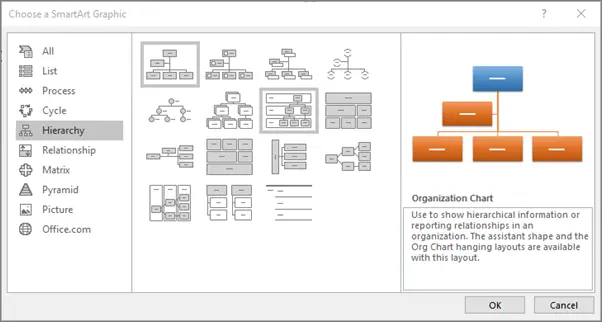
Use SmartArt for Hierarchy:
- Navigate to the Insert tab on the ribbon.
- Click SmartArt in the illustrations section, then select the Hierarchy option.
- Choose a hierarchy layout that best suits your org chart style (e.g., “Organization Chart”).
Populate the SmartArt Diagram:
- Manually enter the names, titles, and reporting structure (managers) into the SmartArt diagram. You can click on the diagram shapes and enter text directly into them to populate the org chart.
- The diagram will auto-adjust as you add new shapes or employees to the chart.
Customize the Org Chart:
- Use Excel’s design tools to modify the colors, shapes, and overall layout of the chart.
- You can add or remove shapes, adjust connectors, and change formatting to fit your organizational structure.
Google Sheets: How to generate an Org Chart using Google Sheets
Prepare Your Data:
- Open your data in Google Sheets with the same structure as mentioned earlier: Name, Role/Title, and Manager.
Create the Org Chart in Google Drawings:
- Open Google Drawings (go to Google Drive, click New > More > Google Drawings).
- Use the shape tool to insert boxes representing each employee’s position.
- Manually type in the name and title for each person.
Connect the Shapes:
- Use the line or connector tool to draw lines between shapes representing reporting relationships. For instance, connect each manager with their direct reports to visually represent the hierarchy.
Customize the Org Chart:
- Adjust the colors, fonts, and shapes to match your company’s branding and make the chart more visually appealing.
- Resize shapes, change their positions, and add or remove connections as necessary.
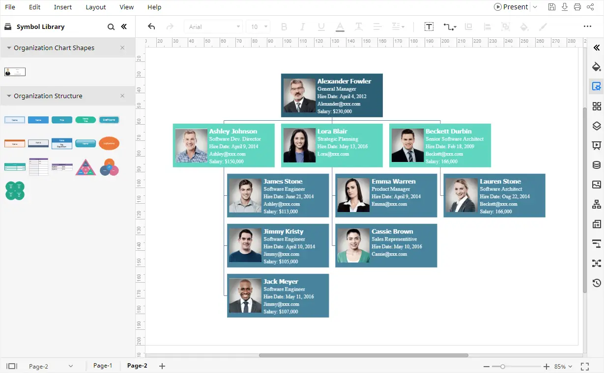
Apple Numbers: How to generate an Org Chart using Apple Numbers
Import Your Data:
- Open your spreadsheet in Apple Numbers and ensure it’s structured with the required columns: Name, Role/Title, and Manager.
- Apple Numbers doesn’t offer a direct org chart creation tool, but you can manually transform your data into a visual representation by using the available shapes and connector tools.
Create the Org Chart:
- Use the Shapes tool in Apple Numbers to insert boxes for each employee, and manually input their names and titles.
- Use the Connector tool to draw lines between the shapes, establishing relationships based on the “Manager” column from your spreadsheet. This will visually represent the hierarchy within your organization.
Edit and Customize the Org Chart:
- After you’ve added the positions and relationships, you can customize the chart’s design by adjusting the colors, resizing shapes, and arranging the boxes to make the chart more visually appealing and organized.
- Apple Numbers allows you to change the style of the shapes and text, offering some flexibility in how the org chart looks.
Export the Org Chart:
- Once you’re happy with your org chart, you can export it in various formats such as PDF, PNG, or JPEG, depending on your needs.
- You can also share the Numbers file with collaborators for easy editing or feedback.
Creately: How to generate an Org Chart using Creately
Prepare Your Spreadsheet Data:
- Prepare employee IDs, names, titles, and manager references in your spreadsheet, then save it as CSV for Atlas import.
Import Your Spreadsheet into Creately:
- Open Creately Atlas and choose Import from CSV. Review the AI column-mapping suggestions and validation results before generating the hierarchy from employee IDs and manager references.
Customize the Org Chart:
- Adjust the layout, colors, and visible fields to make the org chart clear. In Atlas, choose compact or full cards rather than resizing individual person or position cards.
Collaborate in Real-time:
- Use Creately’s collaboration tools to allow team members to edit and provide feedback on the org chart simultaneously.
Export or Share the Org Chart:
- Once you’re satisfied with the org chart, export it in formats like PDF, PNG, or SVG, or share it with a link for easy access and sharing with stakeholders.
This process makes it simple to create professional org charts from spreadsheets, with added flexibility for customization and collaboration. We’ll be exploring Creately’s org chart capabilities in more detail later.
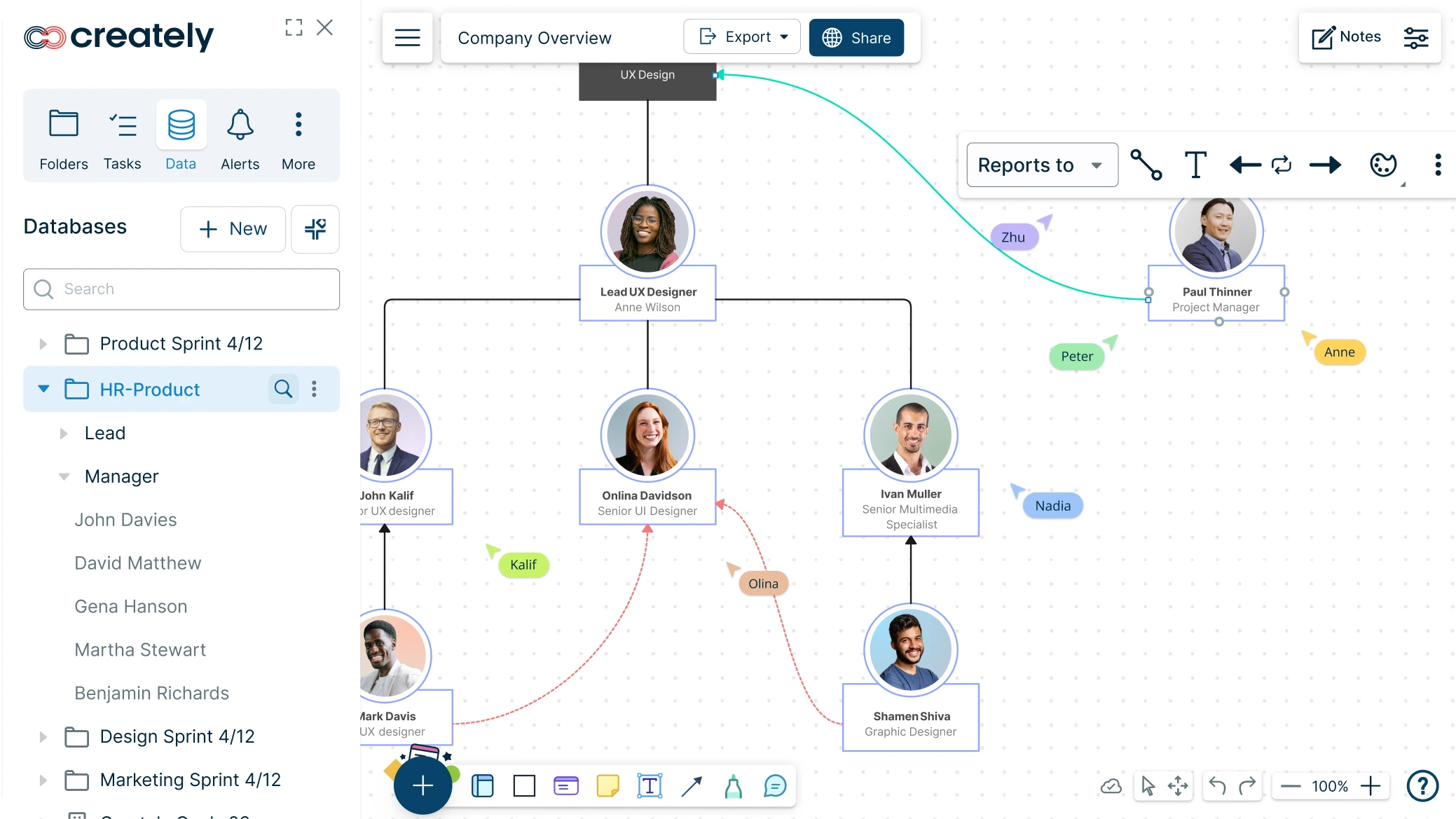
Step 3: Automate with Add-ons or Plugins
To speed up the process, there are add-ons and plugins available that can help automate org chart creation from spreadsheets. These can simplify the mapping of spreadsheet data into a diagram:
Org Chart Creator: This plugin is available for both Excel and Google Sheets and automates the process of generating org charts from your spreadsheet data.
Data Linking Add-ons: These add-ons can link your spreadsheet data with visualization tools, ensuring that when your spreadsheet is updated, the org chart also reflects those changes.
Step 4: Finalize and Export
Once your org chart is created, follow these steps to finalize it:
Customize the Design:
- Adjust the design to match your organization’s visual identity. You can modify colors, shapes, and fonts to make the chart more readable and aligned with company branding.
Export Options:
- After finishing your org chart, export it to various formats such as PDF, PNG, or SVG.
- You can also embed the chart in presentations, reports, or websites, depending on your needs.
Share and Collaborate:
- If you are using tools like Google Sheets or Google Drawings, sharing and collaboration are simple. Just use the sharing options to give team members access to edit or view the org chart in real-time.
- For Excel, you can share the file and allow others to make updates, or save it as a PDF for easy distribution.
Creating an org chart from a spreadsheet can be a straightforward process with the right tools. By organizing your data properly and using built-in features in Microsoft Excel, Google Sheets, or advanced diagramming tools, you can efficiently visualize your organization’s hierarchy. Whether you’re working with a small team or managing a larger organization, these steps will help you create a clear, professional org chart that aligns with your team’s structure and facilitates communication.
Limitations of Using Spreadsheet Tools for Org Charts
Spreadsheet tools are useful for storing employee data, but they are not always ideal for building and maintaining org charts. The limitations become more noticeable as the organization grows or changes frequently.
Common challenges include:
- Reporting lines need to be arranged manually in many spreadsheet tools.
- Updates can become time-consuming when employees change roles or managers.
- Large teams can make the chart crowded and difficult to read.
- Duplicate names or missing manager fields can create hierarchy errors.
- Collaboration may lead to version confusion if the chart is shared as a static file.
- Exported charts may need extra formatting before they are usable in reports or presentations.
For small, one-time org charts, spreadsheets may be enough. For larger or frequently updated charts, a dedicated org chart tool is usually easier to manage.
How to Create an Org Chart From a Spreadsheet in Creately
For the Atlas CSV importer, follow our step-by-step guide to creating an org chart from a CSV file in Creately Atlas, including column mapping, validation, and import-preview checks.
Spreadsheet tools can work for small, static org charts. Creately becomes more useful when you need to generate the chart from structured HR data, keep it updated, review it with others, or customize it for leadership, HR, or planning discussions.
Step 1: Prepare Your Spreadsheet
Create a spreadsheet with one row per employee. Include columns such as employee ID, name, title, manager ID or manager name, department, location, email, and employee photo if needed. Clean the data before importing so reporting lines are easier to match.
Using employee IDs or emails can help reduce mismatches when two employees have similar names.
Step 2: Import and Map the Data
Export your Excel or Google Sheets data as CSV and upload it to Creately Atlas. During import, review the suggested mappings for name, title, manager, department, employee ID, email, and location.
Atlas validates missing employee IDs, unknown manager references, and reporting cycles before import so you can correct the records before building the chart.
Step 3: Generate the Org Chart
Generate the org chart from the imported data. Creately uses the manager relationships in your spreadsheet to create the reporting structure automatically, so you do not have to draw each connection manually.
After generation, review the hierarchy for missing managers, duplicate names, unmatched IDs, blank fields, or outdated roles.
Step 4: Customize the Layout and Employee Cards
Adjust the layout, colors, employee cards, photos, and visible fields so the chart is easy to read for the intended audience. For example, HR may need department and location fields, while leadership may prefer a cleaner view focused on reporting structure.
You can include employee photo references in the data and review their mapping so each photo appears on the correct person card.
Step 5: Create Focused Views and Keep the Chart Updated
Use Atlas filters and smart groups to review employees by department, role, location, or other recorded fields. Focus view isolates a department or reporting subtree for a clearer discussion.
Confirm the supported connection and refresh process for your account, because a CSV import alone does not establish an ongoing spreadsheet sync.
Step 6: Collaborate, Share, or Export
Invite HR teams, managers, or leadership to review, comment, or edit with the right access level. This helps everyone work from the same chart instead of exchanging static files.
When the chart is ready, share it with a link or export it as PNG, PDF, or SVG for reports, presentations, and stakeholder review.
Ready-to-Use Org Chart Templates from Creately
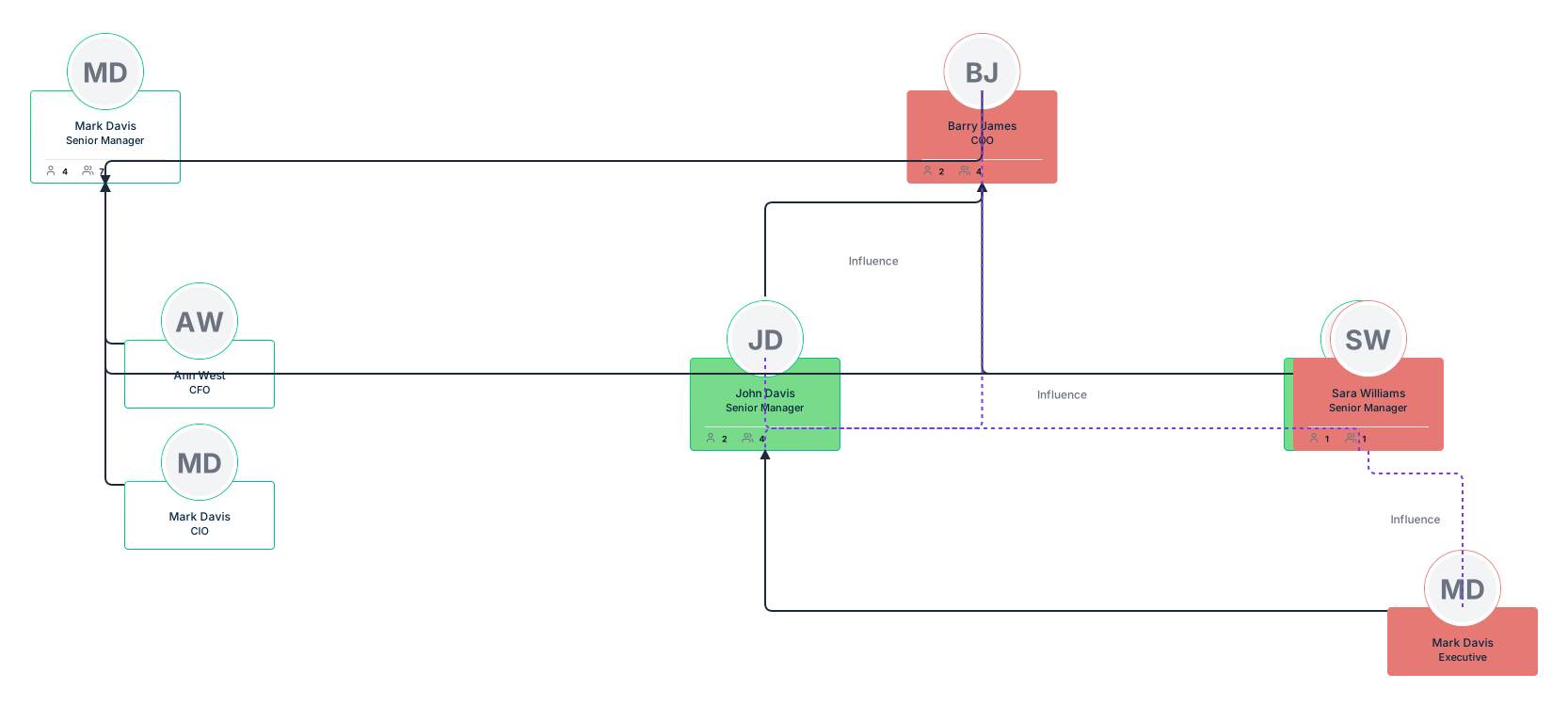
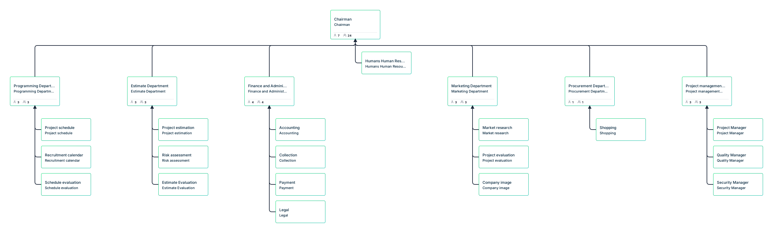
Templates can be useful when you want a starting layout before importing or organizing your own data. The examples below show common org chart formats for HR teams, employee-photo charts, nonprofits, sales teams, and functional departments.
Comprehensive HR Department Organizational Chart Template
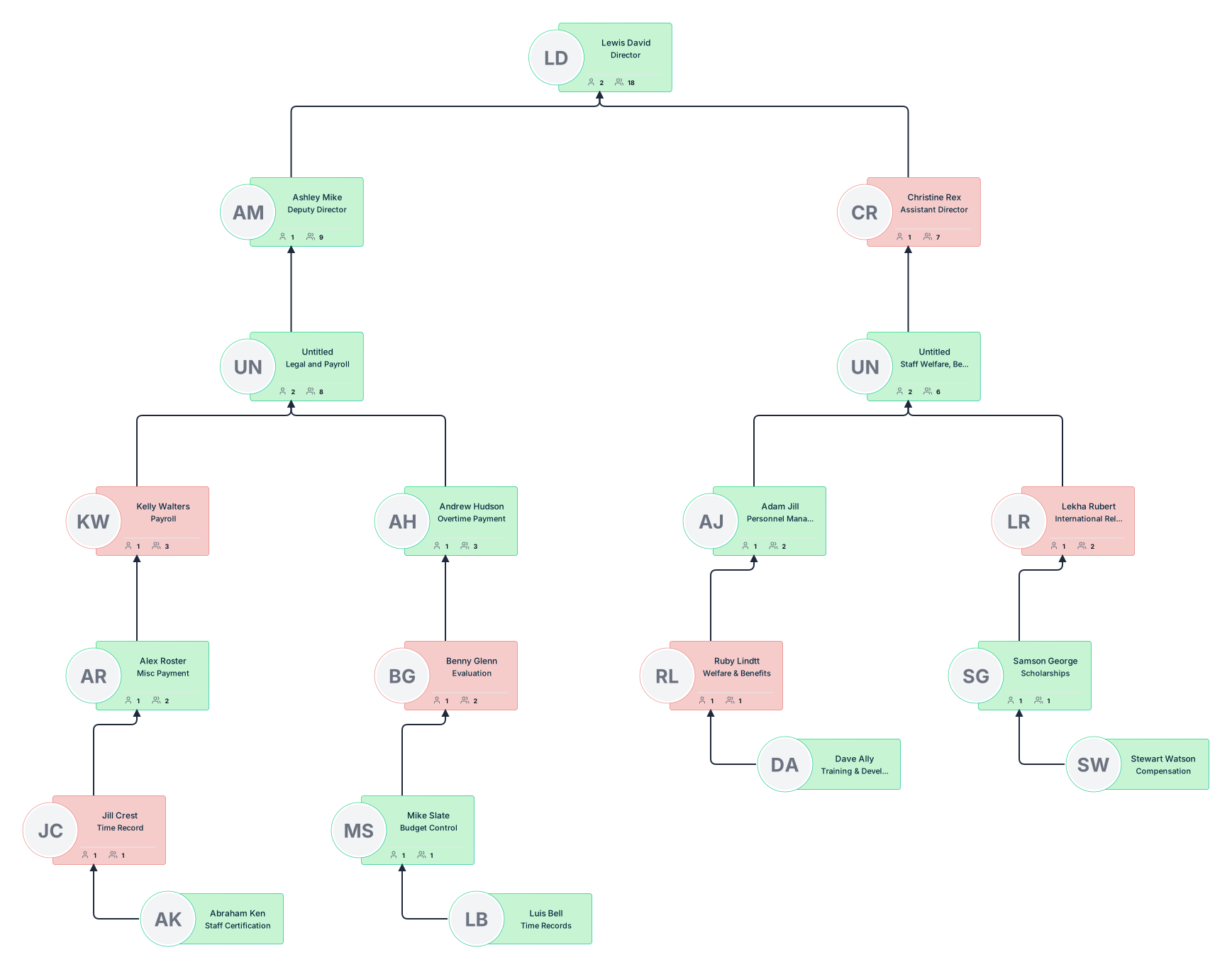

Visual Org Chart Template with Employee Photos
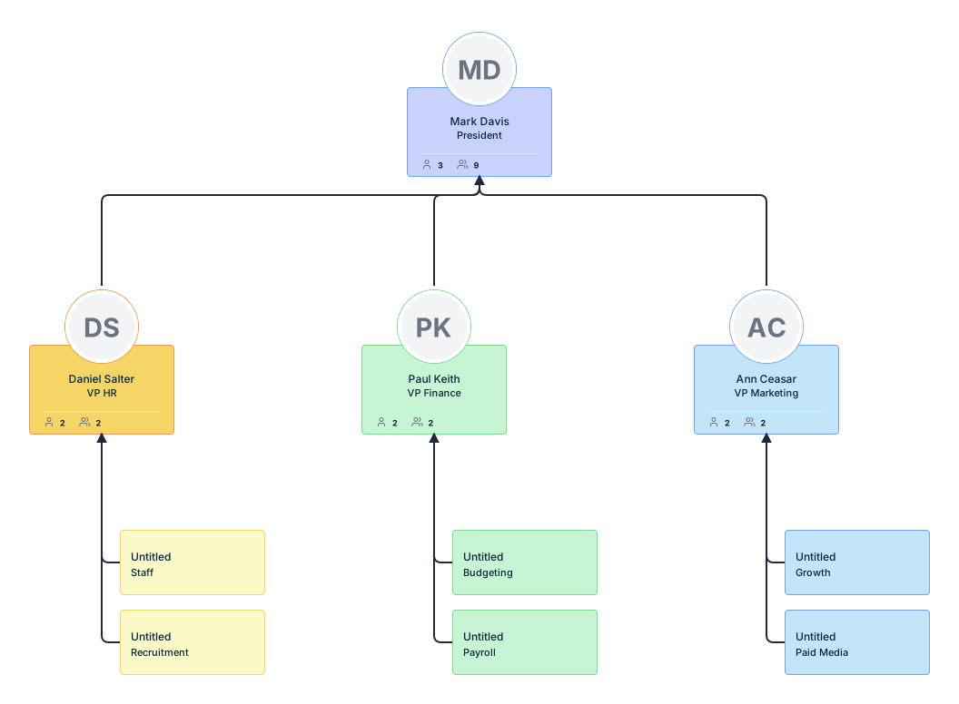
Nonprofit Organization Hierarchy Chart Template
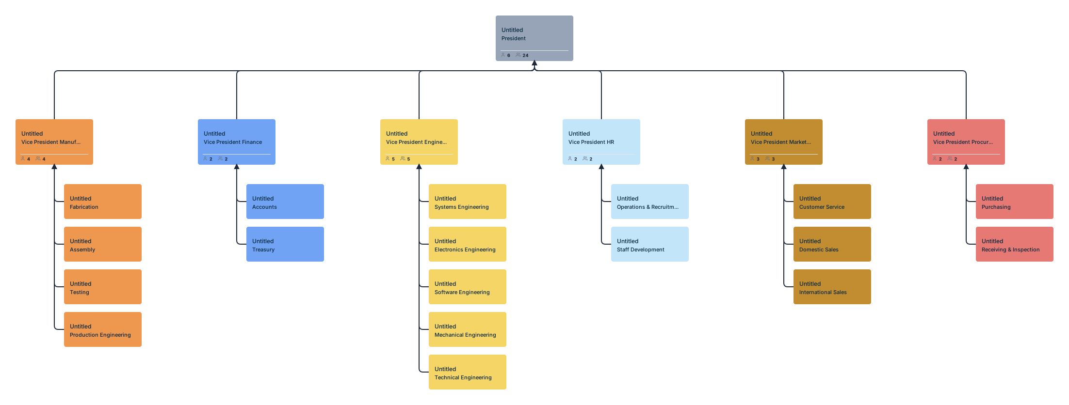
Sales and Influencer Team Structure Org Chart Template
Functional Departmental Structure Org Chart Template
Creately, Microsoft Excel, Google Sheets, and Apple Numbers for Generating an Org Chart using a Spreadsheet
| Feature | Microsoft Excel | Google Sheets | Apple Numbers | Creately |
|---|---|---|---|---|
| Ease of Use | Moderate: Requires SmartArt or manual setup. | Moderate: Manual creation with shapes. | Moderate: Manual creation with shapes. | Easy: Drag-and-drop interface with intuitive tools. |
| Org Chart Templates | Available via SmartArt (Hierarchy layouts). | No built-in templates for org charts. | No built-in templates for org charts. | Extensive pre-designed org chart templates. |
| Data Import for Charts | Supports manual or CSV import for SmartArt. | Requires manual entry or CSV import. | Requires manual entry or CSV import. | Atlas imports CSV exports from Excel or Google Sheets with reviewed AI field mapping. |
| Automation for Org Charts | Semi-automated with SmartArt; limited scalability. | Manual: Requires linking shapes manually. | Manual: Requires linking shapes manually. | Generates the hierarchy after field mapping and data validation. |
| Customization | Moderate: Limited to SmartArt features and manual edits. | Moderate: Customization via shapes and colors. | Basic: Limited to colors, shapes, and text. | Extensive: Customizable styles, layouts, and advanced editing options. |
| Real-Time Collaboration | Available via Office 365 for web version. | Built-in with Google Workspace. | Limited: Only available with iCloud sharing. | Built-in, with real-time collaboration and comment features. |
| Visualization Features | Basic: SmartArt shapes, colors, and layouts. | Basic: Requires inserting and styling shapes. | Basic: Requires inserting and styling shapes. | Atlas: Hierarchical auto-layout, photo cards, compact views, and department focus. |
| Cross-Platform Accessibility | Desktop and web versions (Office 365). | Web-based, works on any device with a browser. | Mac and iOS devices only; no web version. | Available on web and desktop apps with cross-platform compatibility. |
| Integration with Other Tools | Integrates with other Office tools (Word, PowerPoint). | Integrates with Google Workspace apps. | Limited integration within the Apple ecosystem. | Integrates with various tools including Google Workspace, Microsoft 365, and custom APIs. |
| Scalability | Moderate: Can handle medium-sized org charts but gets complex for large ones. | Moderate: Suitable for small to medium org charts. | Limited: Not ideal for large org charts. | Highly scalable, suitable for simple to complex org charts. |
| Export Options | Excel, PDF, and image formats. | Google Sheets, PDF, and other file formats. | PDF and Excel formats; limited image options. | Atlas exports PDF, PNG, SVG, and CSV. |
| Best For | Small to medium org charts with moderate effort. | Collaborative efforts for basic org charts. | Simple org charts on Apple devices. | Creating professional org charts with minimal effort and maximum customization. |
Helpful Resources
Design, manage, and share your organizational structure with Creately's org chart software. Visualize roles, responsibilities, and relationships within your organization with ease using org chart generator.
Easily make organizational charts to visualize the reporting structure of your organization for effective HR planning and management with org chart maker.
Editable Online or Download for Free
Summary of Comparison
Microsoft Excel: Works for simple org charts, especially if your team already uses Microsoft Office. It is less suitable for large, frequently changing charts.
Google Sheets: Useful for basic collaborative data management, but the org chart visualization still requires manual setup or another tool.
Apple Numbers: Suitable for simple org charts on Mac or iOS, but limited for larger structures or automated chart generation.
Creately: Best suited for teams that want to generate org charts from structured data, customize the layout, collaborate with others, and keep the chart easier to update over time.
A spreadsheet is a good starting point for building an org chart because it already contains the core information: people, roles, and reporting lines. For small teams, Excel, Google Sheets, or Apple Numbers may be enough if you only need a simple visual.
For larger or frequently changing teams, a dedicated org chart tool can save time by importing spreadsheet data, generating the hierarchy, flagging mismatches, and making the chart easier to update and share. The most important step is to keep the source data clean, because even the best org chart tool depends on accurate names, roles, and manager relationships.
Resources: Giessner, S.R. and Schubert, T.W. (2019). Power and Vertical Positions in an Organization Chart: A Pre-Registered Replication Report of Study 3a and a Modification of Study 1a, Giessner & Schubert (2007). Collabra: Psychology, 5(1), p.25. doi: https://doi.org/10.1525/collabra.216.