In project management, especially within the PMP® methodology, organizing stakeholder input, requirements, and risks is critical for effective planning. An affinity diagram in PMP helps project managers visually cluster large volumes of qualitative data, revealing natural relationships and guiding strategic decisions.
This guide explains how to apply affinity diagrams within the project management framework, covering key process groups, practical examples, and best practices, so your team can turn ideas into structured project deliverables.
What Is an Affinity Diagram?
An affinity diagram is a visual technique used to organize related ideas, facts, or data into clusters based on their natural relationships. It’s a convergent thinking tool used during brainstorming, stakeholder analysis, risk identification, and requirement gathering.
By creating an affinity diagram, project teams can:
- Synthesize unstructured inputs (e.g., interview notes, feedback)
- Discover patterns without pre-defined categories
- Align on themes across cross-functional teams
- Convert raw data into actionable outputs (like scope baseline, risk register, or WBS)
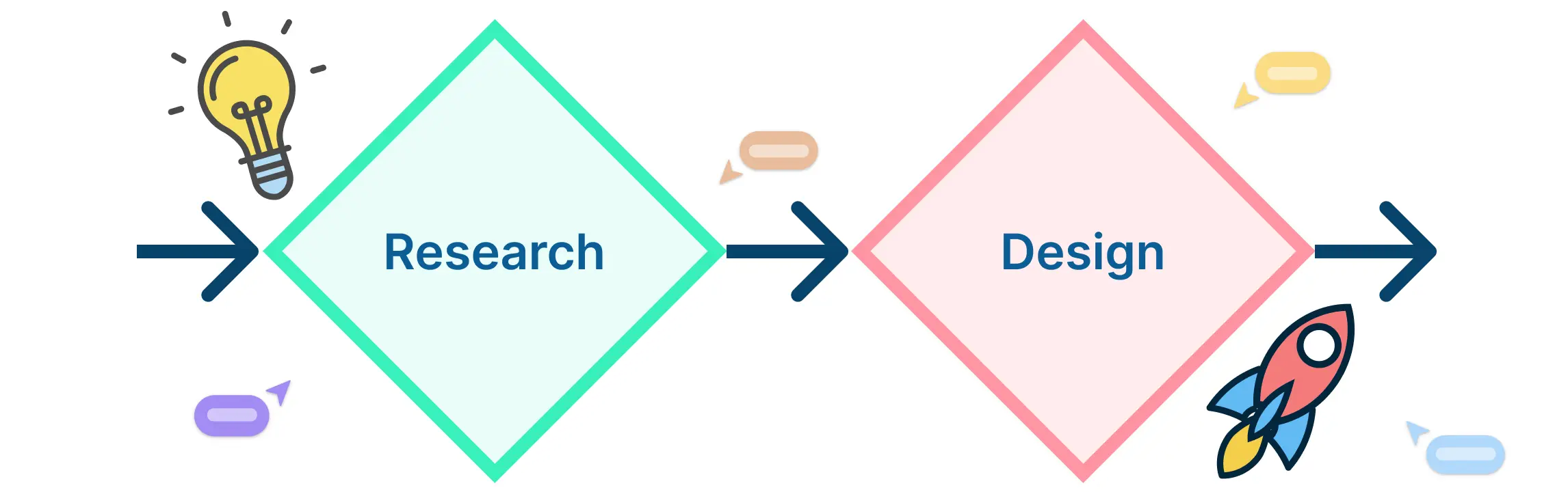
How to Use an Affinity Diagram in Project Management?
As one of the seven management and planning tools, the affinity diagram plays a crucial role in organizing unstructured information during the planning phase. These seven tools—affinity diagram, interrelationship diagram, tree diagram, matrix diagram, prioritization matrix, activity network diagram, and process decision program chart (PDPC)—are designed to improve clarity, collaboration, and strategic planning.
Why Affinity Diagrams Are Valuable for PMPs
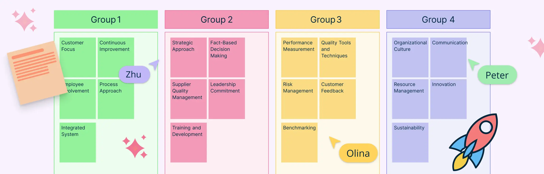
Among the seven tools, the affinity diagram is particularly helpful at the start of a project, when teams are flooded with stakeholder inputs, brainstorming ideas, or early-stage risks. It enables project managers to sort complex data into meaningful clusters, helping teams move from ambiguity to clarity. This technique directly supports PMP methodologies by feeding into structured outputs like the Work Breakdown Structure (WBS), risk register, and communication plans.
Below is a breakdown of how affinity diagramming supports key PMP planning processes across different knowledge areas:
PM Process | Knowledge Area | Affinity Diagram Use Case |
| Collect Requirements | Scope Management | Group stakeholder needs into requirement themes |
| Identify Risks | Risk Management | Cluster risks into categories (technical, regulatory, etc.) |
| Plan Communications | Communications Management | Organize stakeholder feedback into communication needs |
| Develop Project Charter | Integration Management | Structure goals, assumptions, and stakeholder concerns |
| Create WBS | Scope Management | Group deliverables and tasks into a hierarchy |
How to Create a Project Management Affinity Diagram
Follow this six-step process to build a practical and effective affinity diagram that supports PMP outputs:
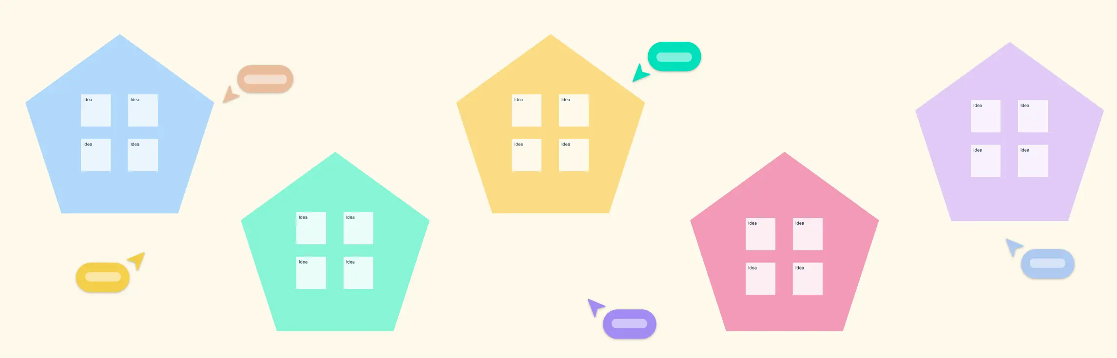
Step 1: Gather Raw Inputs
Begin with brainstorming, stakeholder interviews, or workshops. Record every idea, requirement, or risk on a separate note—digital or physical. Avoid editing or grouping prematurely. Creately’s Affinity Diagram Maker helps to speed up input capture with infinite canvases and live collaboration.
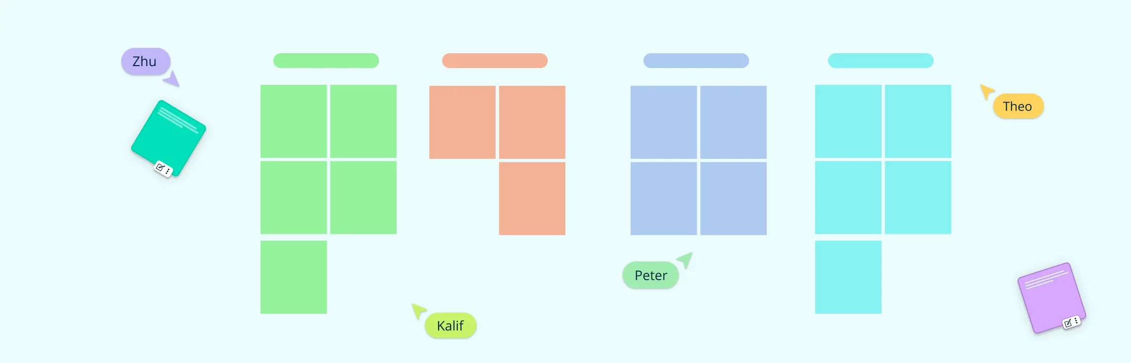
Step 2: Initial Clustering
Without setting categories in advance, start grouping related items. Let connections emerge organically. Encourage multiple team members to participate to reduce bias.
Step 3: Label Clusters
Assign a short, descriptive label to each group based on the common theme. These labels become your guiding categories for scope, risks, or communication priorities.
Step 4: Refine Themes
Review the clusters together. Merge overlapping ones or split ambiguous groups. Re-label if needed. This step is key for clarity and alignment.
Step 5: Translate into Project Management Artifacts
Link each cluster to a specific deliverable:
- Requirement clusters → Scope baseline or Requirements Traceability Matrix
- Risk clusters → Risk register or Risk breakdown structure (RBS)
- Communication clusters → Stakeholder engagement plan
Step 6: Review and Align
Validate the diagram with stakeholders or team leads. Ensure all key inputs are captured and interpreted correctly before integrating into planning documentation.
Ready-to-Use Affinity Diagram Templates
To help you get started quickly, we’ve curated a selection of PMP affinity diagram templates designed for key project management activities. These templates streamline the clustering process and align directly with project management deliverables, saving you setup time and boosting team collaboration.


Real-World Examples of Project Management Affinity Diagrams
Example 1: Software Project: Requirement Clustering
During the Collect Requirements stage, group notes into themes like:
- Functionality
- Security
- User Experience
Then, prioritize clusters to form your Requirements Document and Product Backlog.
Example 2: Construction Project: Risk Identification
Cluster risks into:
- Environmental
- Safety
- Procurement
Feed these clusters directly into the Risk Register and use them to define response strategies.
Example 3: Organizational Change: Stakeholder Feedback
Cluster concerns from interviews or surveys into:
- Communication
- Training
- Job Impact
These inform the Stakeholder Engagement Plan and communication matrix.
Conclusion: Make Affinity Diagrams Central to PMP Planning
The affinity diagram transforms raw, unstructured input into meaningful categories that directly support PMP planning and documentation. Whether you’re collecting requirements, identifying risks, or mapping communication needs, this technique brings clarity and structure to complex projects.
By integrating affinity diagrams into your PMP methodology—and using smart tools like Creately—you ensure stakeholder alignment, enhance planning accuracy, and improve project outcomes.
Resources:
Lucero, A. (2015). Using Affinity Diagrams to Evaluate Interactive Prototypes. Human-Computer Interaction – INTERACT 2015, 9297, pp.231–248. doi:https://doi.org/10.1007/978-3-319-22668-2_19.
Widjaja, W. and Takahashi, M. (2016). Distributed interface for group affinity-diagram brainstorming. Concurrent Engineering, 24(4), pp.344–358. doi:https://doi.org/10.1177/1063293x16657860.
FAQs About PMP Affinity Diagram
Can a PMP affinity diagram be used in agile or hybrid project environments?
How does a PMP affinity diagram support stakeholder engagement?
What’s the difference between an affinity diagram and a work breakdown structure (WBS)?
Are there industry-specific use cases for PMP affinity diagrams?
What are the best practices for using affinity diagrams?
What are common pitfalls to avoid when using affinity diagrams?
- Over-clustering: Don’t force unrelated ideas together. It leads to unclear analysis. Premature labeling: Avoid naming clusters too early—this can bias thinking.
- Under-facilitation: Lack of structure can cause confusion. Assign a facilitator.
- Ignoring feedback: Validate clusters with the team before locking them into documentation.