As organizations grow, so does the complexity of managing their workforce effectively. Traditional tools and static diagrams no longer suffice to keep pace with rapid changes in employee roles, team dynamics, and operational hierarchies. HR leaders now require solutions that offer both precision and adaptability.
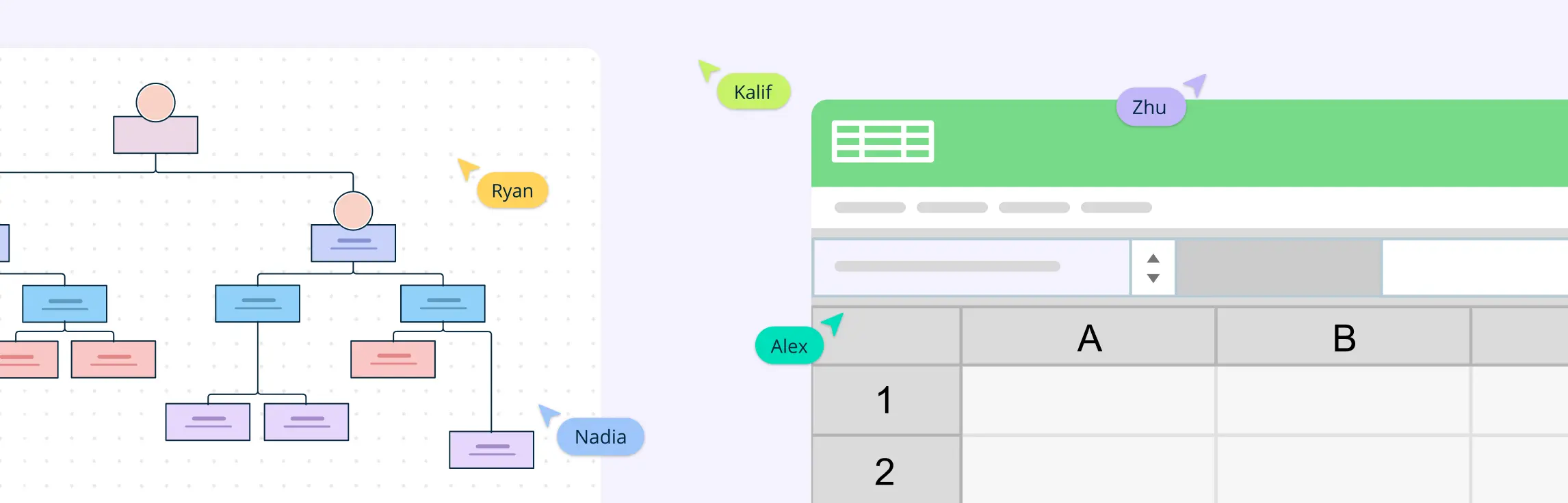
Creating an org chart is essential for businesses to visualize the structure of their team, departments, and workflows. Excel, being a widely used tool, might seem like a simple option for creating an org chart. However, it comes with certain limitations that can make it difficult to maintain and update over time. In this guide, we’ll show you how to make an org chart in Excel and explore the benefits of using Creately, a tool designed to overcome the challenges Excel presents.
An organization chart is a graphical representation of relationships between an organization’s departments, functions, and people. It can also indicate the flow of data, responsibility, and reporting from bottom-up or top-down. Its usage across the globe is a testament to its effectiveness. Below are some rules for drawing organizational charts and org chart best practices to make your org chart more meaningful and useful.