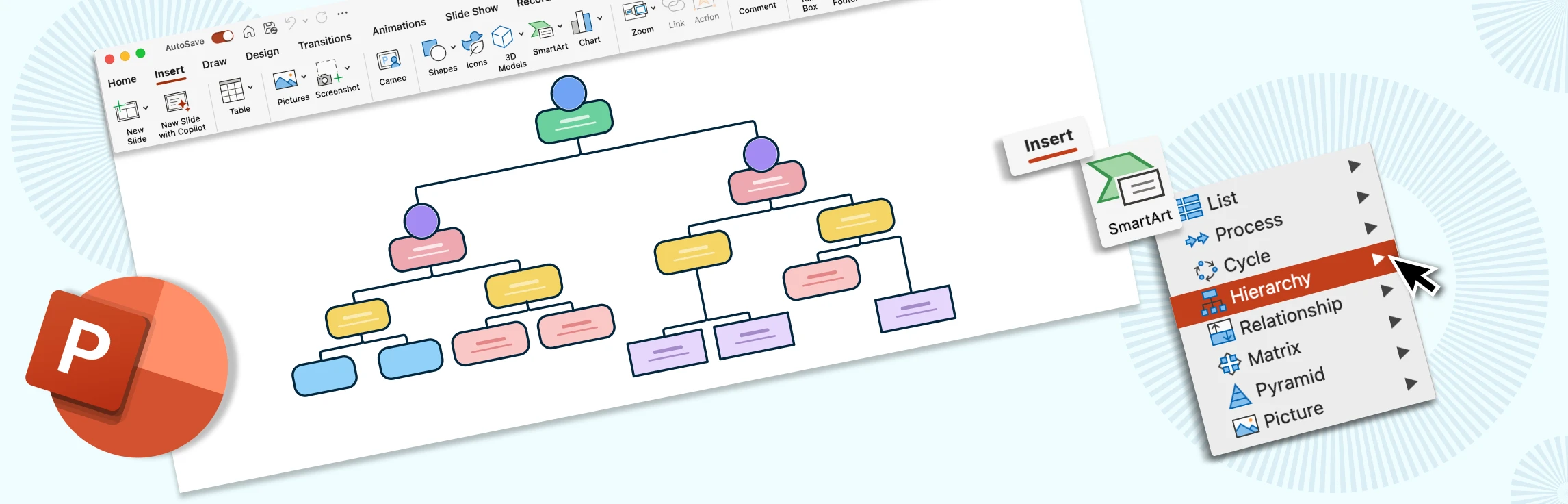
Creating an organizational chart in Google Docs is a handy way to visualize team structures and reporting lines, especially if you’re already working within Google Workspace. While Docs doesn’t have a built-in org chart feature, you can still build one using the Drawing tool with shapes and connectors. In this guide, we’ll walk you through the steps, share tips to make the process easier, highlight the drawbacks of using a Google Doc org chart, and suggest a better alternative for more complex or professional org charts.
How to Make an Org Chart in Google Docs
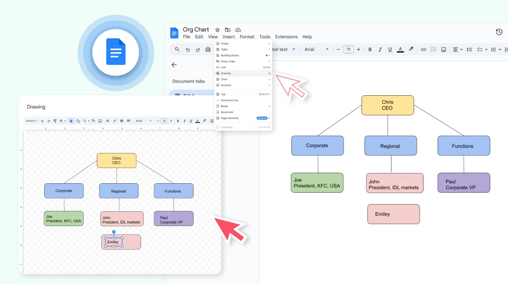
Step 1: Open Google Docs and Insert a Drawing
Start a new or existing document in Google Docs. Open the Insert menu, choose Drawing, then select New to open a drawing canvas. This tool lets you create shapes, connectors, and text boxes to build your org chart directly within Docs.
Step 2: Structure Org Chart Data
Set up a basic table with employee names, their job titles, and reporting managers. This will serve as a reference when organizing roles in your org chart.
Step 3: Use Shapes to Represent Roles
On the drawing canvas, click the Shape icon and choose rectangles, circles, or other shapes to represent positions. Place them in a hierarchy according to your reference table. Start with leadership at the top and team members below. Using consistent shapes makes the chart easy to follow.
Step 4: Add Connectors to Show Relationships
Go to the Line tool and select an Elbow Connector or Arrow Connector. Draw lines between shapes to illustrate reporting relationships, such as manager-to-subordinate connections. These connectors help keep the chart structured and readable.
Step 5: Enter Employee Names and Titles
Double-click inside each shape to add text. Enter the person’s name, job title, or role. Keep text concise so it fits neatly in the shape and the chart remains clear, especially if you have many roles to display.
Step 6: Format and Adjust Layout
Customize your chart by changing fill colors, borders, and fonts to match your document style or company branding. Align shapes evenly, resize boxes if necessary, and group related roles together. This makes the chart more professional and visually appealing.
Step 7: Save and Insert the Drawing into Your Document
Once your chart is complete, click Save and Close. The org chart will appear in your Google Doc, where you can resize or move it as needed. If you need to update it later, simply double-click the chart to reopen the Drawing tool for edits.
Tips for Drawing Org Charts in Google Docs
Use the grid view in Drawing for better alignment: Turn on gridlines in the Drawing tool to help keep shapes evenly spaced and aligned. This makes the chart look more professional and easier to follow.
Keep the hierarchy simple and avoid too much text in each box: Focus on names and job titles only. Adding too much detail can make the chart cluttered and harder to read, especially in larger organizations.
Apply consistent colors and shapes for departments or teams: Use the same shape style for all roles and apply color coding to group departments or teams. For example, marketing roles in blue and operations roles in green. Consistency makes the chart clearer at a glance.
Use copy-paste for repeating role boxes to save time: Instead of drawing new shapes each time, duplicate an existing shape with the right formatting. This ensures uniform sizing and style while speeding up the process.
Use Google Sheets to generate the org chart: If your org structure is already listed in Google Sheets, use Insert → Chart → Organizational Chart to generate one automatically. Once created, you can copy the chart into Google Docs. Keep in mind that you will need to generate the org chart again in Google Sheets before copying it to Docs if there are any updates.
Limitations of Creating Org Charts in Google Docs
No built-in org chart templates: Unlike tools designed specifically for diagramming, Google Docs doesn’t provide ready-made org chart layouts. You have to manually create the structure using the Drawing tool, which takes more effort.
Manual drawing process can be time-consuming: Every box, line, and connector has to be placed and adjusted by hand. This can be manageable for small teams but quickly becomes tedious as the organization grows.
Difficult to scale for large or complex structures: When an org chart includes multiple departments or layers of management, the Drawing canvas can become cluttered and hard to navigate. Resizing or reorganizing large charts is particularly challenging.
Limited design and formatting options compared to dedicated tools: The Drawing tool has only basic formatting features, such as shape fills, outlines, and text styles. It lacks advanced options like custom templates, automated layouts, or dynamic formatting.
No real-time collaboration on the chart itself (only on the document): While multiple people can edit the Google Doc at once, the Drawing tool isn’t collaborative. Only one person can edit the chart at a time, which slows down teamwork and updates.
Create Org Charts with Creately - Google Docs Alternative
Discover how to create the org chart more efficiently using Creately.
Step 1: Start with a template or blank canvas
Open Creately and choose an org chart template from the library for a quick start, or begin on a blank canvas if you want full flexibility in designing the chart from scratch.
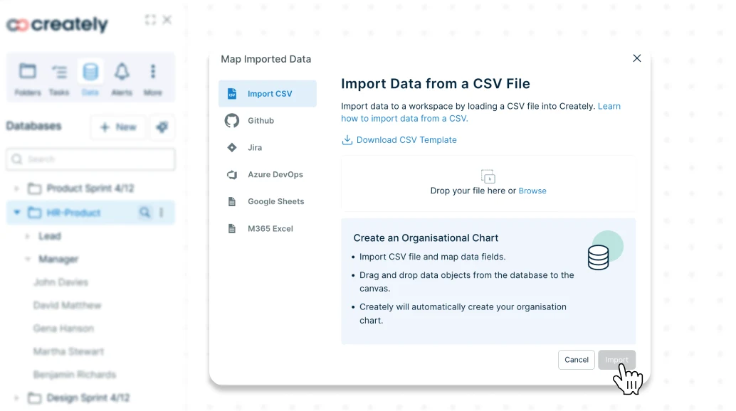
Step 2: Import Data or Add Roles Manually
Save time by importing a CSV file that lists employee names, job titles, and supervisors. Creately will automatically build the hierarchy for you. You can also add roles individually by drawing shapes on the canvas.
Step 3: Define the Reporting Hierarchy
When you import data into Creately, reporting lines are generated automatically. If you’re adding roles by hand, use smart connectors to link managers with their direct reports. The connectors realign automatically as you rearrange the chart, keeping everything tidy.
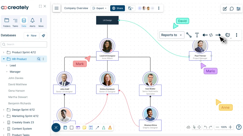
Step 4: Customize Your Org Chart
Make your chart more informative and easier to read by adding colors, tags, and profile pictures. Highlight departments with color coding, mark unfilled roles, or emphasize key positions for better clarity.
Step 5: Collaborate and Add to Google Docs
Collaborate in real time with your team by adding comments, notes, or file attachments. Once complete, export the org chart as an image or PDF and easily add it to Google Docs, Powerpoint slides, or other reports.
Why Creately is a Better Alternative for Org Charts
Instead of manually creating a Google Doc org chart, consider using Creately which is purpose-built for visual collaboration. This makes the org chart creation process much faster and more professional. Key benefits of this include,
Auto-generate Org Charts: Import employee data from spreadsheets or HR systems to automatically generate and update charts. This keeps your org chart accurate and saves time whenever your structure changes.
Dynamic org chart views: Keep org charts automatically updated. When connected to a central employee database, any change like role, team, or reporting line instantly appears in sync across all charts, eliminating manual updates.
Drag-and-drop design: Quickly add, move, or rearrange roles without worrying about alignment or connectors. Smart auto-layout ensures the chart stays clean and professional-looking as you edit.
Ready-made templates: Start with professionally designed org chart templates that you can customize in minutes. These templates cover common organizational structures, giving you a solid foundation right away.
Scalability: Easily handle large or complex organizational structures without the chart becoming cluttered. Features like infinite canvas and zooming help you navigate and manage big teams smoothly.
Real-time collaboration: Allow multiple team members to work on the org chart simultaneously. Comments, @mentions, and version history make it easy to collaborate and keep everyone aligned.
Presentation Mode: Switch to a clutter-free, full-screen view to showcase your org chart in meetings. Emphasize specific teams or roles without the extra step of exporting to slides.
Data-Rich Nodes: Add employee info, files, or links directly within each role box, transforming your org chart into a centralized resource rather than just a visual structure.
Free Org Chart Templates from Creately


Helpful Resources for Making Org Charts
Learn the basic rules of making org charts and best practices to make them effective.
Find out how to make an organization chart in Microsoft Word.
Discover the org chart diagram templates that can help visualize your organization.
FAQs about Making Org Charts in Google Docs
Does Google Docs have a built-in org chart feature?
Can multiple people edit the Google Doc org chart at the same time?
Can I import a spreadsheet to automatically create an organizational chart in Google Docs?
Is Google Docs good for large or complex org charts?
Is there a ready-made Google Docs organizational chart template?
Resources
Bartlett, Jennifer. “The Power Deep in the Org Chart: Leading from the Middle.” Library Leadership & Management, vol. 28, no. 4, 11 Aug. 2014, https://doi.org/10.5860/llm.v28i4.7091.
Burton, Richard M., and Børge Obel. “What Is Organizational Design?” Information and Organization Design Series, vol. 4, 2004, pp. 43-85, https://doi.org/10.1007/978-1-4419-9114-0_2.