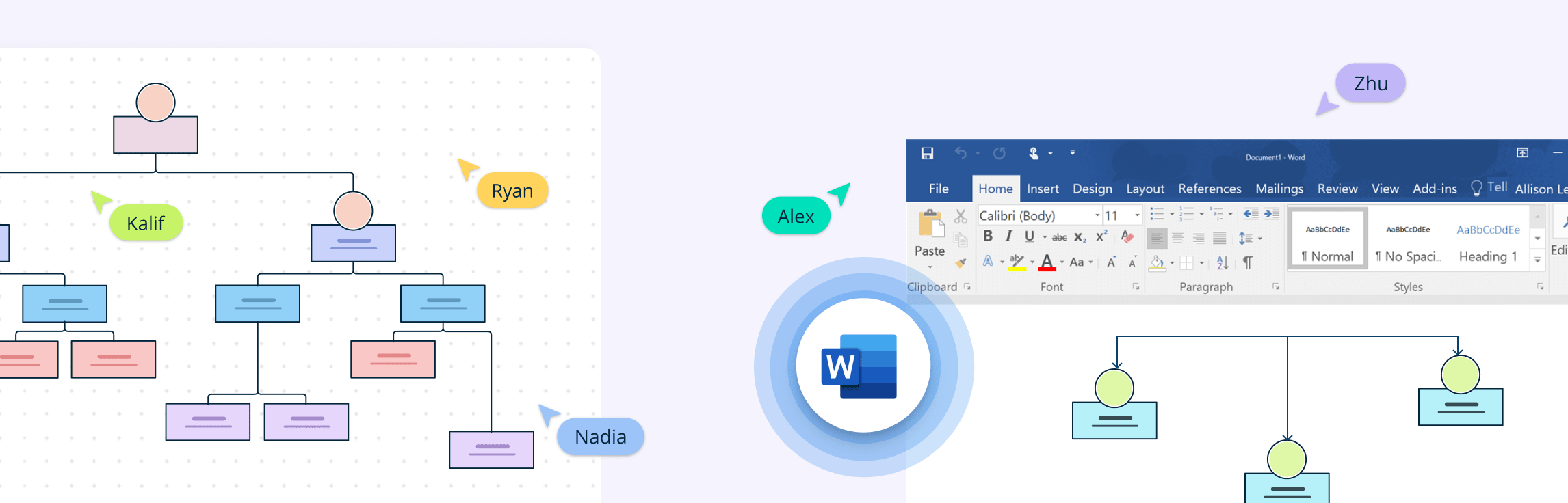
Creating an org chart in PowerPoint is a quick way to visualize reporting lines and align teams right inside your deck. This guide gives you step-by-step instructions on how to build an org chart in Powerpoint, practical layout and formatting tips to keep branches tidy and on brand, and common pitfalls to avoid. You’ll also get a clear view of PowerPoint’s limitations, and why a dedicated tool like Creately is better suited for creating professional organizational charts.
How to Make an Org Chart in PowerPoint Manually
Step 1: Start with a Blank Slide and Structure Data
Open a new blank slide in PowerPoint so you have a clean canvas to build your org chart. Prepare a simple table with employee names, job titles, and direct supervisors. This becomes the foundation of your org chart and helps you place roles correctly on the slide.
Step 2: Add Role Boxes
Insert rectangles (or rounded rectangles) from the Shapes menu and use them for roles. Type in the person’s title and name inside each box.
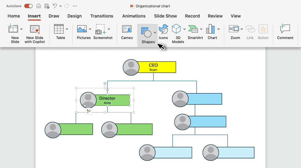
Step 3: Duplicate and Arrange
Copy and paste the first box to create more roles, then arrange them in levels of hierarchy, placing leaders at the top and their teams below.
Step 4: Connect with Lines
Use elbow connectors or straight lines from the Shapes menu to draw connections between managers and subordinates, showing reporting relationships.
Step 5: Align and Customize
Use the Align and Distribute tools to keep everything evenly spaced, then apply colors, text formatting, and grouping so the chart looks clean and professional.
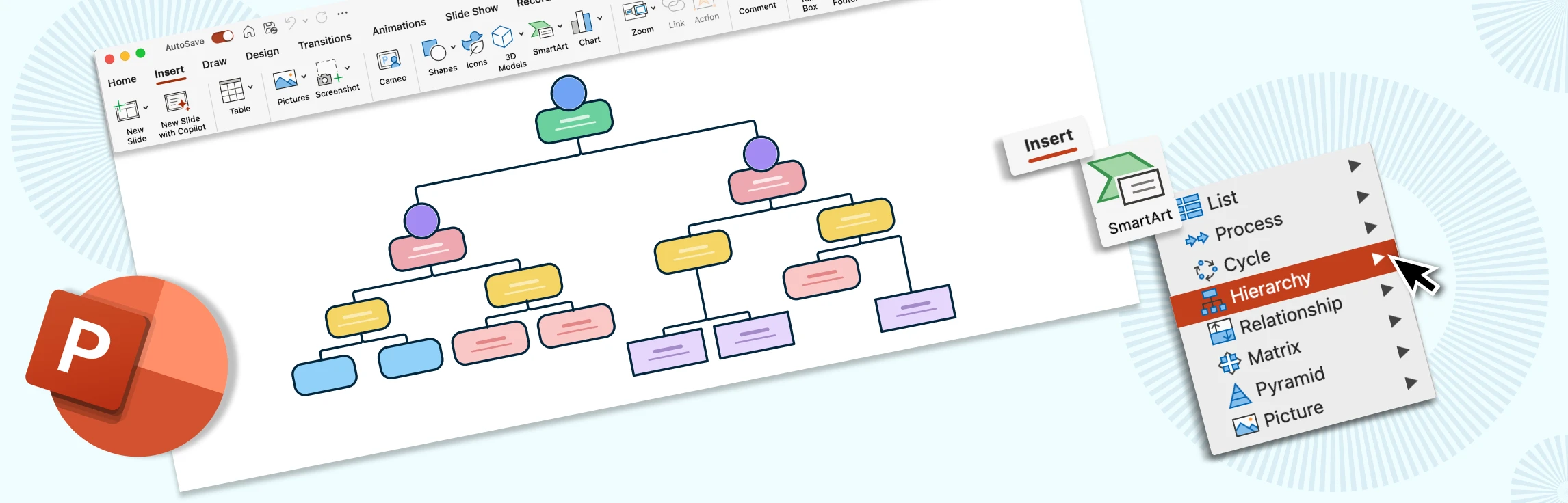
How to Do an Org Chart in PowerPoint Using SmartArt
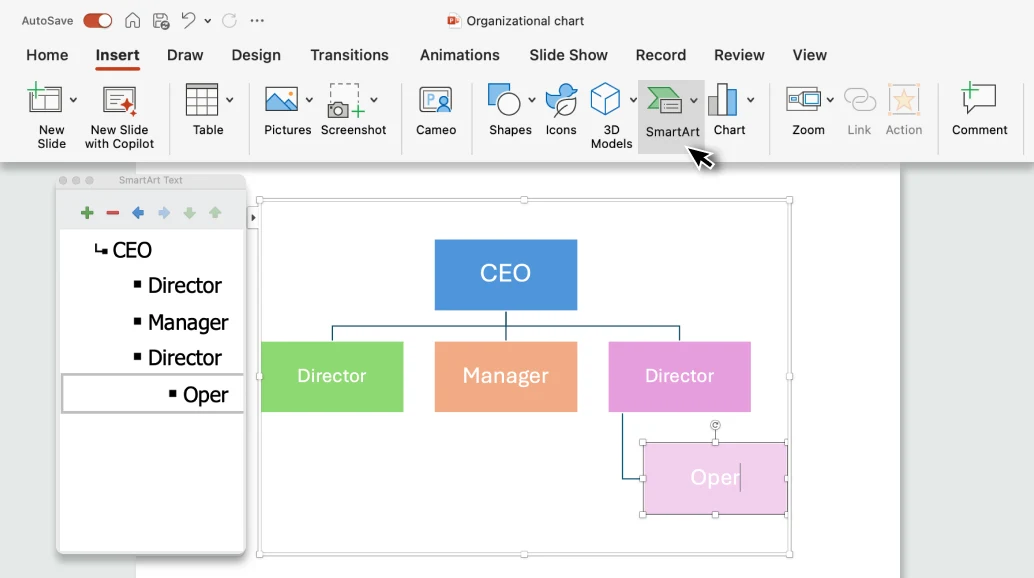
Step 1: Insert an Org Chart
Open PowerPoint and go to the Insert tab. Select SmartArt, then choose Hierarchy and Organization Chart, pick the style you prefer, and click OK to insert it. Next, open the Text Pane to build out the structure. Start by sketching the top two or three levels first so the hierarchy aligns well with SmartArt’s automatic layout.
Step 2: Build the Hierarchy
In the Text Pane, type the name and title for each role. Use Add Shape to insert positions, choosing Above, Below, Assistant, After, or Before depending on where the role fits. You can also use Tab to create a subordinate (demote) and Shift+Tab to promote a role up the hierarchy.
Step 3: Tidy the Structure
With the chart selected, refine the layout using SmartArt’s formatting options. Adjust the layout to declutter crowded branches, align and distribute boxes for even spacing, and turn on guides to keep columns straight and readable.
Step 4: Format for Readability
Apply a SmartArt Style from the Design tab to give your chart a polished look. Adjust colors to distinguish departments, and use Format options to customize shape fill, outlines, text styles, fonts, and sizes so the chart aligns with your brand or presentation theme.
Step 5: Share and Export
When finished, save the file as a .pptx if you want to make future edits. For distribution, export the chart as a PDF or PNG to embed in wikis, documents, or emails. If presenting, consider duplicating the slide and creating progressive reveals. This shows only a few levels at a time, so the audience can follow the structure more clearly.
Tips for Making Org Charts in Powerpoint
Plan before you click: Draft the top 2-3 levels first. It prevents SmartArt from fighting your structure later. Decide on a suitable naming pattern (e.g., Name on line 1, Title on line 2) and stick to it.
Format for clarity, not decoration: Use high contrast (dark text on light shapes). Avoid busy gradients and heavy shadows. Use one font family and a tight size range (e.g., 18-24 pt for names, 12-14 pt for titles). Apply theme colors for consistency and save a custom theme if you’re matching your brand.
Consider converting to shapes: Convert to shapes only when you need pixel-perfect tweaks. Know the tradeoff: you lose the automatic hierarchy behavior of SmartArt after converting.
Limitations of Organizational Charts in Powerpoint
Rigid auto-layout: SmartArt can fight manual tweaks; large charts become cramped or messy.
Scales poorly: Navigation and editing are painful beyond a few hundred roles; cross-functional views require duplicate slides.
No real-time collaboration: Co-editing is limited; comments aren’t anchored to specific nodes with metadata.
Manual updates: Changes to titles/teams aren’t data-driven; there’s no live sync with HRIS/Sheets.
Limited context: Boxes hold minimal structured data; attachments, notes, and tasking require external tools.
Create Org Charts with Creately - PowerPoint Alternative
Lets find out how to create the org chart more easily using Creately.
Step 1: Start with a Template or Blank Canvas
Open Creately and either choose a free org chart template from the library or start with a blank canvas. Templates give you a quick head start, while a blank canvas offers full control.
Step 2: Import or Add Roles
Instead of building everything manually, you can import your org chart data into Creately as a CSV file with columns for employee names, job titles, and supervisors. Creately will then automatically generate the full hierarchy for you. If you prefer, you can also add roles one by one using shapes.
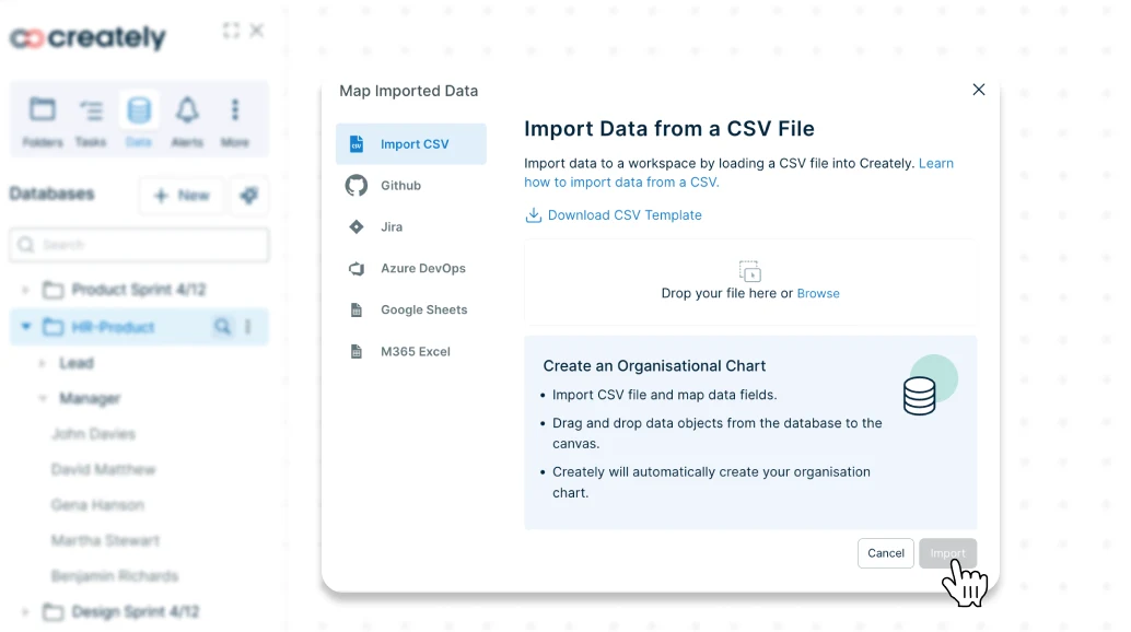
Step 3: Connect the Hierarchy
When you import a CSV into Creately’s workspace, connections are created automatically. If adding roles manually, use smart connectors to link managers to their direct reports. These connectors adjust dynamically as you rearrange roles.
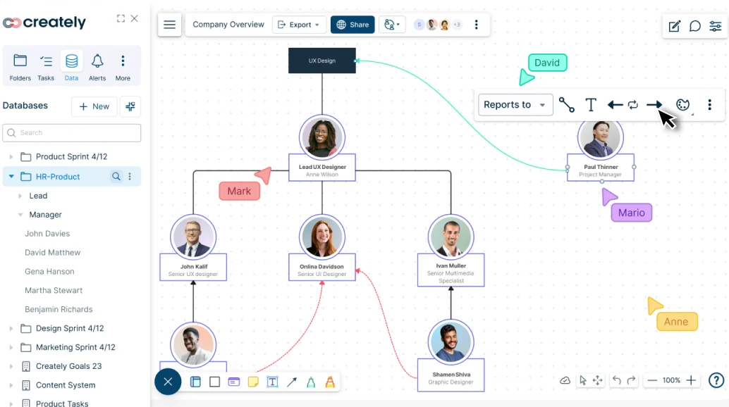
Step 4: Customize the Chart
Style your org chart with colors, tags, and even profile photos. For example, color-code departments, tag vacancies, or highlight critical roles so the structure is easy to understand at a glance.
Step 5: Share, Collaborate and Add to Powerpoint
Invite your team to edit the chart in real time, add comments, and attach notes for context. When presenting, use Creately’s built-in Presentation mode. You can also export the org chart as an image or PDF and drop it straight into PowerPoint.
Why Creately is a Better Alternative for Org Charts
Automatic Org Chart Generation: Import your employee data from a CSV, and Creately instantly generates a complete org chart. No manual dragging and connecting required. The hierarchy is built for you, saving hours of setup time.
Databased Linked Org Charts: Keep every chart in sync with your data source. Connect to employee databases so updates to roles, titles, or teams automatically flow into all org charts with no manual edits required.
Built for scale: Creately’s infinite canvas lets you map even the largest organizations without running out of space. With auto-layout and smart connectors, reporting lines stay clean and readable, no matter how many departments or levels you add.
Real-time collaboration: Work on your org chart together with your team. Comment directly on specific roles, @mention teammates for input, and rely on version history to track changes or restore earlier versions.
Built-in Presentation Mode: Present your org chart instantly in a clean, interactive view with no need to export to slides. Unlike PowerPoint, Creately’s charts stay live and up to date, letting you zoom into teams, highlight roles, and expand sections during meetings.
Data-rich nodes: Each role can carry context. Add custom fields like department, location, or headcount. Attach files and links for reference, and use a dedicated Notes Panel to capture role-specific details.
Ready-made Templates: Start faster with reusable layouts. Save templates for departments, projects, or teams, then adapt them as structures change—no need to rebuild from scratch.
Flexible sharing: Share securely with view or edit permissions depending on your audience. Export charts as PNG, PDF, or SVG for easy distribution, or embed them in wikis, intranets, and documents so your org chart is always accessible where people need it.
Free Org Chart Templates from Creately


Helpful Resources for Making Org Charts
Learn the basic rules of making org charts and best practices to make them effective.
Learn how to make organizational charts in Google Docs.
Discover the org chart diagram templates that can help visualize your organization.
FAQs about Making Org Charts in Powerpoint
Should I convert SmartArt to shapes?
Can I build a Powerpoint org chart from Excel data?
How do we collaborate on the powerpoint organizational chart?
When should I switch to a specialized tool?
Resources
Fioretti, Guido, and Beatrice Vitali. “A Visual Database of Organization Charts.” SSRN Electronic Journal, 2022, https://doi.org/10.2139/ssrn.4027997.
Fraser, Ronald. “Reorganizing the Organization Chart.” Public Administration Review, vol. 38, no. 3, May 1978, p. 280, https://doi.org/10.2307/975683.