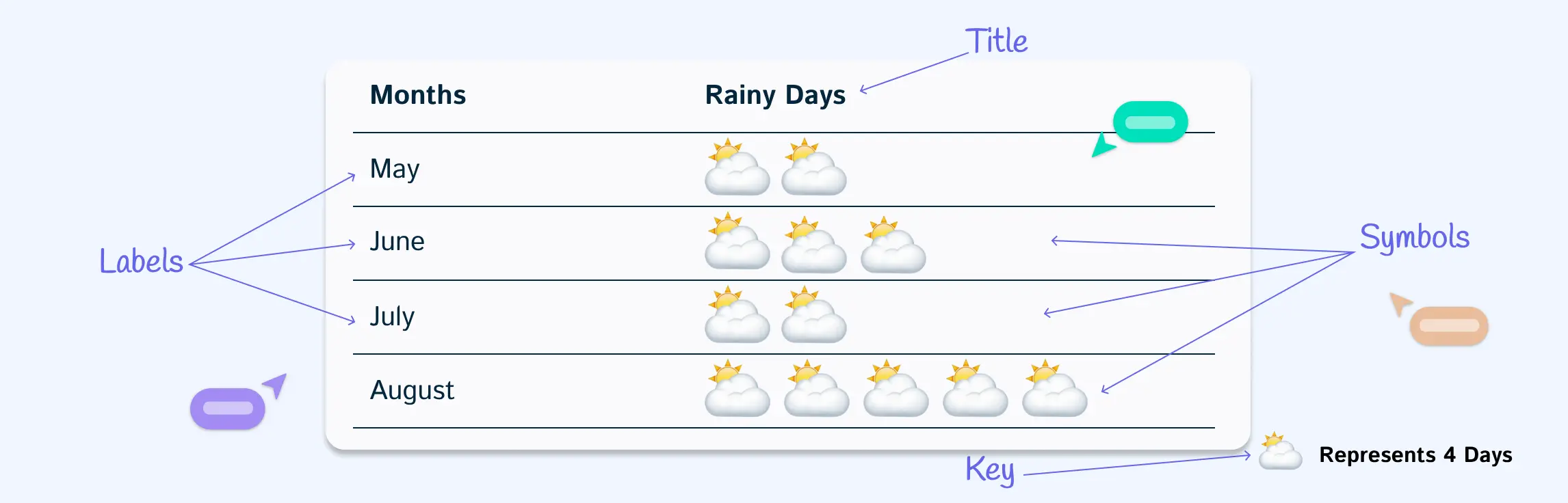
Pictographs turn numbers into pictures, making data easier to read and more fun to explore. Instead of plain figures, you can use icons—like apples for fruit, trees for planting projects, or people for population.
They’re simple, visual, and instantly show patterns or comparisons. In this guide, we’ll look at 10 pictograph examples that highlight just how effective this type of chart can be.
Pictograph Examples for Quick Data Visualization
1. Horizontal pictograph example
Arrange icons from left to right to compare categories instantly. This format is best when you want a quick, side-by-side view of data like sales by product or survey responses.


2. Vertical pictograph example
Stack icons upward to show growth or frequency. It works well for data that needs to highlight “tallest vs. shortest” comparisons, such as monthly attendance or product demand.

3. Pictograph of fruits
Replace numbers with fruit icons to represent counts. This makes it easy to visualize preferences or consumption patterns at a glance, such as how many apples, bananas, or oranges were chosen.

4. Pictograph of population
Use people icons to break down population data into simple, visual chunks. It’s an effective way to show demographics, compare groups, or represent growth trends.

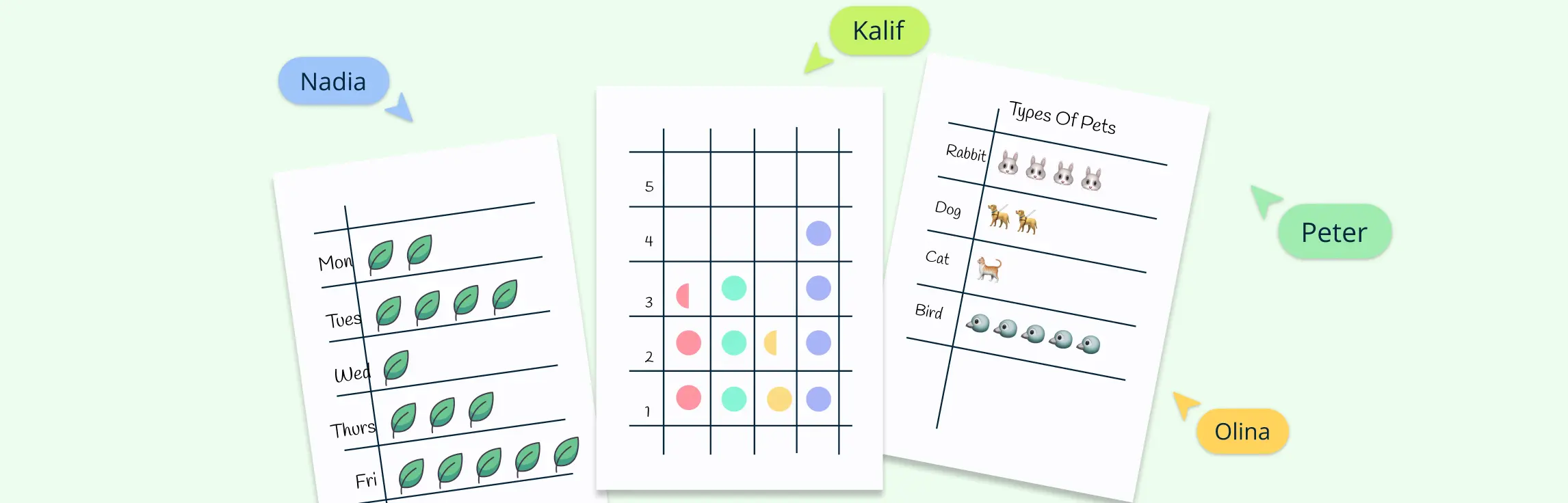
5. Pictograph of animals
Illustrate data with animal symbols to make comparisons engaging. For example, use dogs, cats, and birds to highlight survey results, wildlife counts, or pet ownership statistics.

6. Pictograph of sports
Show popularity or participation in sports by using activity-specific icons like footballs, basketballs, or rackets. It’s a simple way to turn interest or performance data into a visual story.

7. Pictograph of trees
Track environmental or project data with tree icons. Use it to highlight the number of trees planted, compare forest areas, or monitor green initiatives over time.

8. Pictograph of weather
Record daily or seasonal conditions using sun, rain, or cloud symbols. Over time, this creates an easy-to-read chart that reveals weather patterns without relying on complex graphs.

9. Pictograph of flowers
Represent quantities or types of flowers with floral icons. This is useful for showcasing garden data, species comparisons, or survey results in a visually appealing way.

10. Market research pictograph example
Plot survey or customer feedback data using icons that represent products or services. This turns raw research into visuals that make trends and preferences immediately clear.

11. Mode of transportation pictograph example
Display how people travel—by bus, car, bicycle, or walking—using transportation icons. It’s a practical way to compare commuting patterns or lifestyle choices.

12. Maths pictograph example
Use simple icons to replace numbers in math problems, such as stars for addition or subtraction. This transforms abstract calculations into visuals that are easier to interpret.

Why Choose Creately for Creating Pictographs
Creately makes building pictographs simple by combining visual tools with powerful collaboration and customization features. Here’s how its capabilities stand out:
Extensive icon and shape libraries: Quickly access ready-to-use icons for people, objects, weather, transport, and more. You can also upload custom images to match your data perfectly or use built-in Google image search to browse for more.
Customizable templates: Start with professionally designed pictograph templates for fruits, sports, transportation, or market research, and adapt them with your own data.
Flexible visual layout: Arrange icons horizontally, vertically, or in clusters to suit the story your data tells. Creately’s smart alignment and grids ensure everything looks clean and consistent.
Data import and linking: Bring in data directly from Excel, CSV, or Google Sheets and link it to shapes. This makes updating your pictograph effortless whenever the data changes.
Easy formatting and styling: Change colors, resize icons, and add labels or legends to keep your pictograph clear. You can apply themes to make visuals stand out without overcomplicating them.
Real-time collaboration: Work with your team or class on the same canvas. Creately lets you comment, react, and edit together in real time, making group projects or feedback smooth.
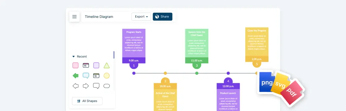
Seamless sharing and exporting: Export your pictograph in formats like PNG, JPEG, SVG, or PDF, or share a secure link. This makes it easy to use pictographs in presentations, reports, or classrooms.
FAQs on Pictograph Examples
What is the main purpose of a pictograph?
How do you read a pictograph?
What are the advantages of using pictograph examples?
What are the disadvantages of pictographs?
Where are pictograph examples used in real life?
Are pictographs suitable for all types of data?