A nonprofit org chart does more than show reporting lines. It helps clarify responsibilities, improve coordination across teams, and make your organization easier to understand.
A nonprofit org chart does more than show reporting lines. It helps clarify responsibilities, improve coordination across teams, and make your organization easier to understand.

Startups move fast. Roles overlap, teams stay lean, and people often wear multiple hats. That is exactly why a startup org chart can be so useful.

Schools and education institutions are complex organizations. Between administrators, teachers, counselors, department heads, and district offices, it’s easy for reporting lines and responsibilities to become unclear, especially as staff change year to year.
Starting a new job comes with a lot of questions. Who do I report to? Who approves what? Who do I go to for HR, IT, or payroll help? Which teams will I work with most?
Most workforce plans suffer from a “data-visualization gap.” HR teams spend weeks meticulously updating headcount numbers in complex spreadsheets, only for those plans to be disconnected from the actual organizational structure.

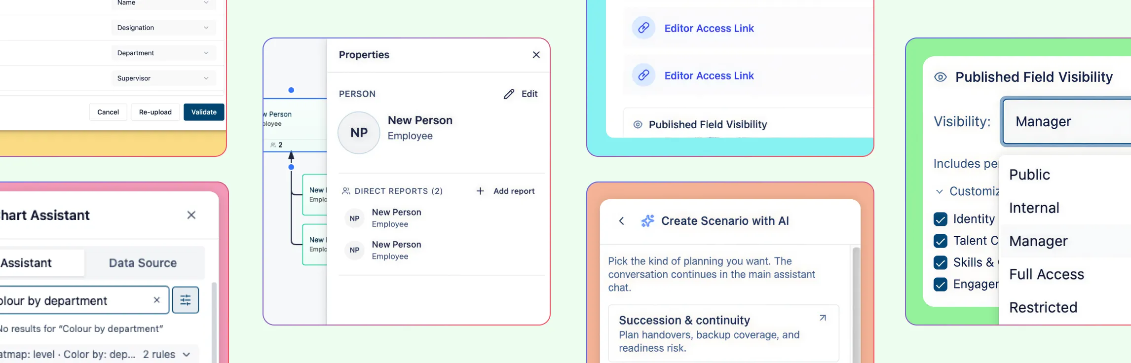
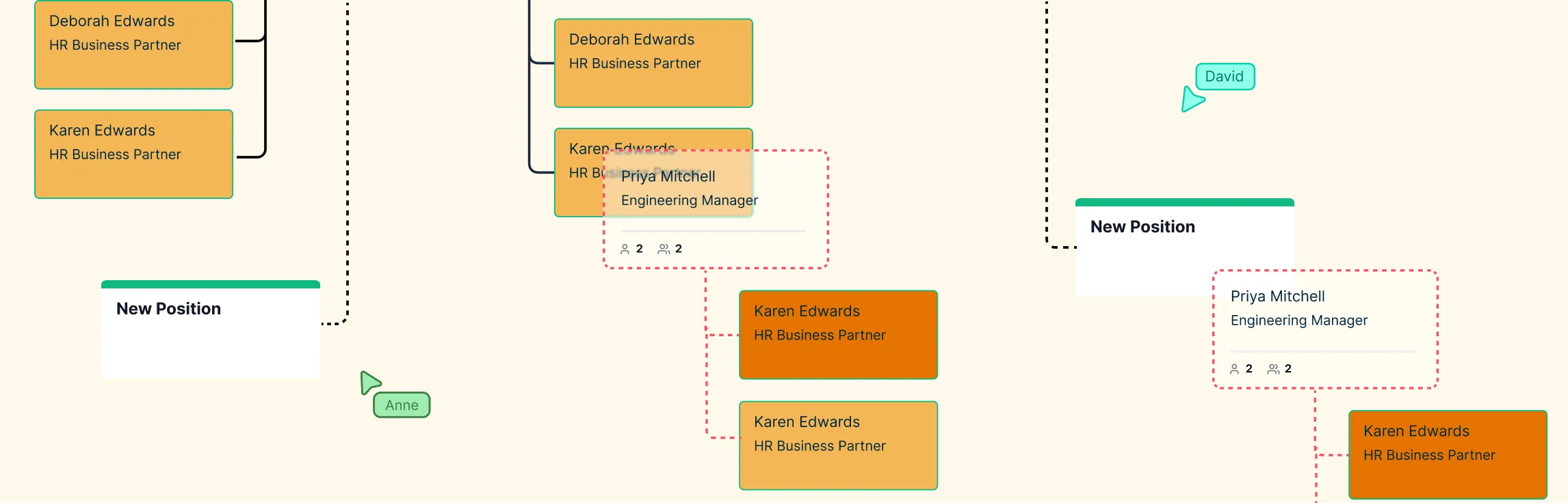
Most organizational design decisions are made in the dark, trapped between static slide decks that hide real impact and live HRIS systems where a single accidental “save” can trigger company-wide panic. This “risk gap” forces leadership teams to choose between committing to a restructure too early or debating endlessly over spreadsheets that can’t visualize reporting depth or span of control. This guide explores how scenario planning replaces guesswork with a “digital twin” of your company—allowing you to model complex reorg planning, visualize structural “deltas,” and test every “what-if” in a secure sandbox before making a single official change.
Compensation decisions carry significant weight, yet the information needed to make them is often fragmented across spreadsheets, reports, and disconnected systems. When pay data lacks organizational context, identifying inequities, inconsistencies, or misalignment with market benchmarks becomes time‑consuming and error‑prone. This guide explores how compensation analysis can be made more effective by connecting pay data directly to org charts—providing a clearer view of how compensation is distributed across roles, teams, and reporting lines, and enabling faster, more confident decision‑making.

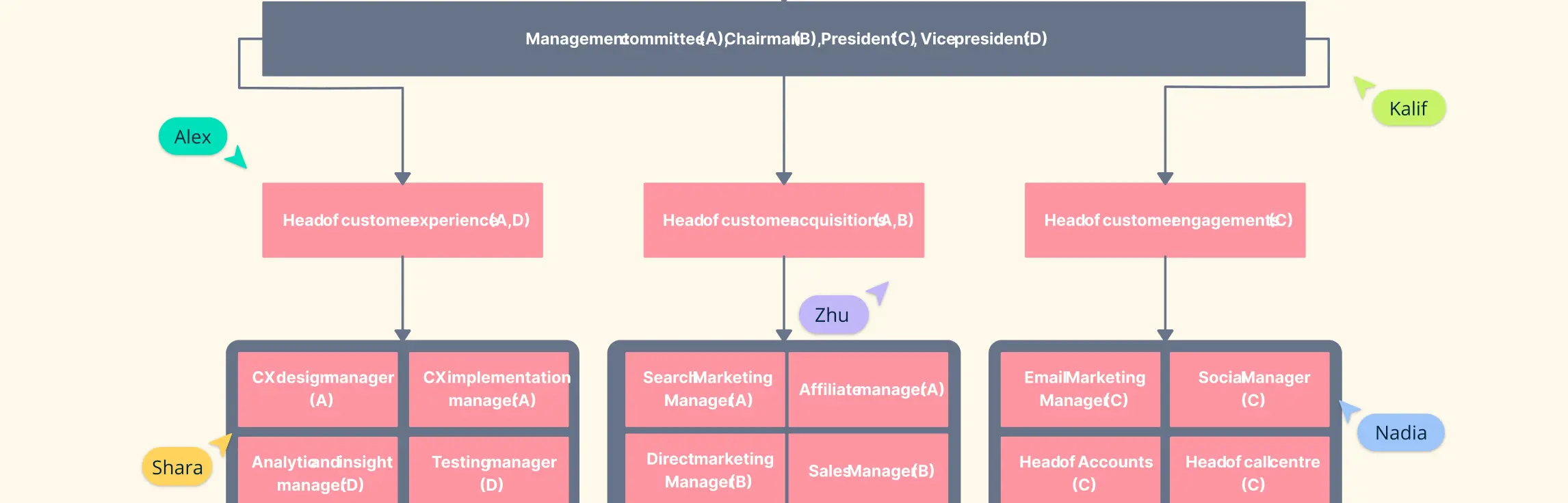
Building a marketing team that clicks isn’t just about hiring the right talent—it’s about creating a structure that sparks collaboration, drives results, and keeps everyone moving in the same direction. Whether you’re scaling a startup or optimizing an enterprise team, getting your marketing org right can be the difference between chaotic campaigns and strategies that actually stick. In this guide, we’ll explore the structures, roles, and best practices that help marketing organizations work smarter, faster, and more creatively.

Getting your line organizational structure right can make all the difference between a team that struggles and one that thrives. The way authority, communication, and decision-making flow in this structure shapes clarity, accountability, and overall performance. Whether you’re leading a small team or a growing business, mastering the line organizational structure helps streamline operations, empower your people, and turn everyday work into meaningful results.

Ever felt like your team’s workflows are trapped in endless loops of emails, approvals, and missed connections? Traditional hierarchies can make communication slow, collaboration clunky, and decision-making frustratingly rigid. That’s where a circular organization structure comes in. By reimagining how teams and leadership connect, this model replaces rigid layers with a fluid, visual system where authority and communication flow naturally in circles.

Traditional organizational hierarchies often leave teams frustrated, decisions get stuck in approval loops, responsibilities overlap, and clarity is lost across departments. Enter the holacratic structure: a modern, role-based approach that distributes authority, clarifies responsibilities, and makes decision-making faster.
Ever feel like your team’s workflows are scattered across endless emails, spreadsheets, and half-finished diagrams? Enter the line and staff organization, a structure designed to bring clarity, balance authority with expertise, and make your team’s reporting lines crystal clear.
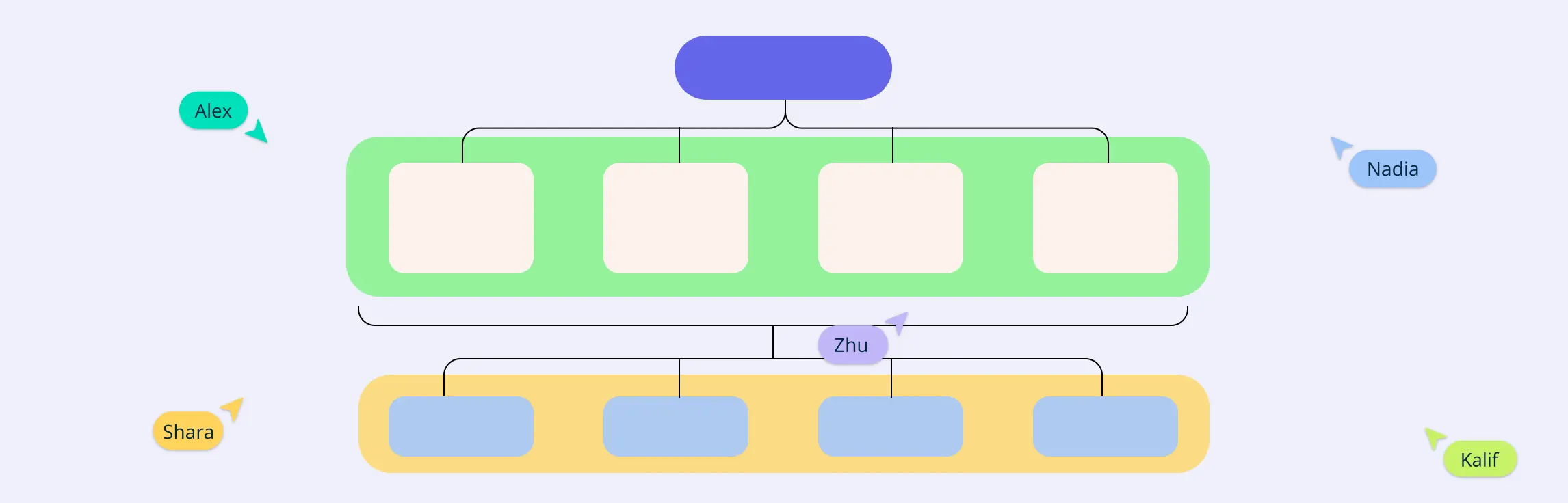
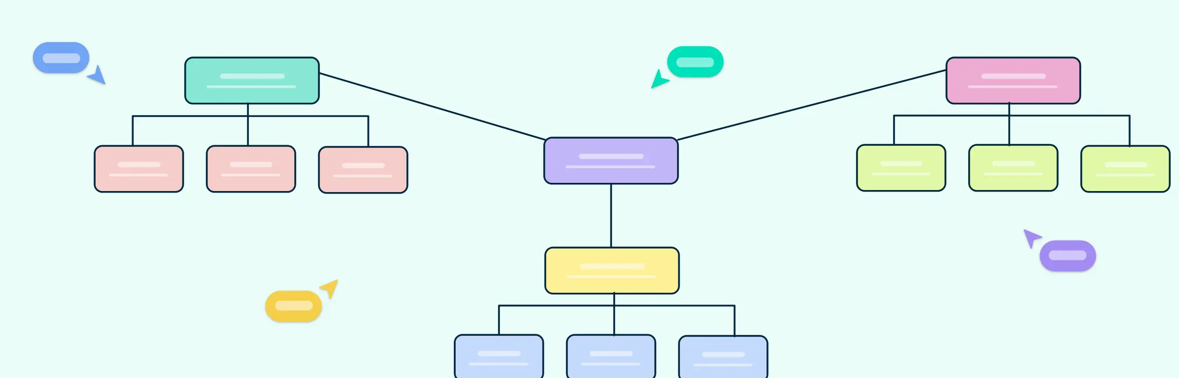
Managing a large organization can sometimes feel like juggling too many balls at once, products, services, regions, and teams all pulling in different directions. When workflows get scattered, decision-making slows down, and accountability becomes murky, frustration sets in. This is where a multidivisional structure comes to the rescue. In this guide, we’ll explore what a multidivisional structure is, its key features, advantages, and challenges, and provide practical templates for visualizing your organization.

Ever feel like your team is stuck in endless email chains, unclear reporting lines, and scattered workflows? Traditional hierarchies can slow decision-making, stifle collaboration, and make it hard to respond quickly to change. That’s where a network structure comes in. Designed for modern, agile teams, this organizational approach emphasizes flexibility, decentralized decision-making, and strong connections between people and functions.

Feeling frustrated with scattered workflows, duplicated tasks, and unclear responsibilities? Many modern teams struggle to keep work flowing smoothly when traditional hierarchies or functional silos get in the way. By organizing your team around end-to-end workflows instead of just job titles or departments, this approach brings clarity, speed, and accountability to your operations. In this guide, we’ll explore what a process-based organizational structure is, its key features, real-world examples, and templates you can use to visualize and streamline your team’s work.
In today’s fast-paced world, waiting for every decision to come from the top can slow your team down—and kill innovation. That’s why more companies are embracing a decentralized organizational structure, giving teams the freedom to act, experiment, and own their work. This guide will take you through the real-world models companies use, the benefits and challenges of decentralization, and actionable steps to implement it successfully.
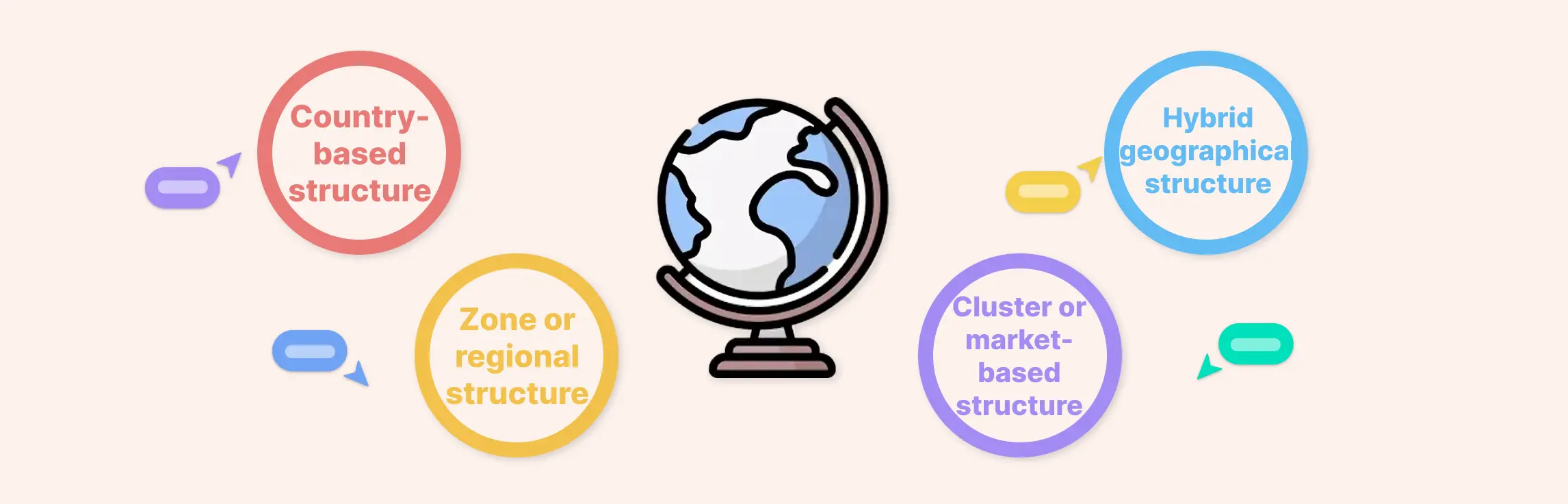
Expanding your business across regions comes with unique challenges—from coordinating teams in different time zones to tailoring strategies for local markets. A well-designed geographical organizational structure helps you tackle these challenges by empowering regional teams to make fast, informed decisions while keeping the company’s overall vision intact. In this guide, you’ll discover practical tips, real-world examples, and actionable steps to create an org chart for your regional structure that scales efficiently and keeps every part of your business aligned.
In a fast-paced business environment, finding a structure that is flexible, practical, and adaptable is essential—and that’s where a hybrid organizational structures shine. Whether your teams are split across functions, products, or regions, a hybrid organizational setup allows you to blend the best of multiple models without losing control or clarity. Hybrid org charts make it easy to visualize this complex structure, helping leaders, managers, and teams see who reports to whom, where responsibilities lie, and how everything connects—so everyone stays on the same page and works smarter together.

Imagine walking into a workplace where everyone knows their role, but nobody feels stuck in a rigid hierarchy. Teams aren’t just groups of people—they’re dynamic hubs of collaboration, creativity, and problem-solving. In today’s fast-moving business world, companies are realizing that the old top-down structures just can’t keep up. Instead, success often comes from small, empowered teams that can adapt quickly, make decisions on the fly, and take ownership of their work. In this guide, you’ll learn what a team based organizational structure is, and how to implement it effectively.
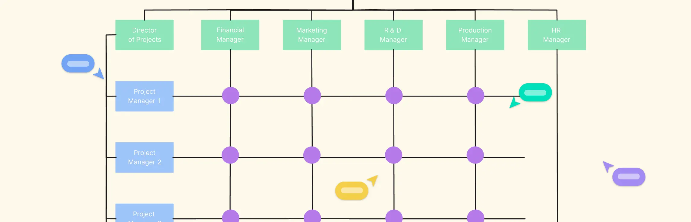
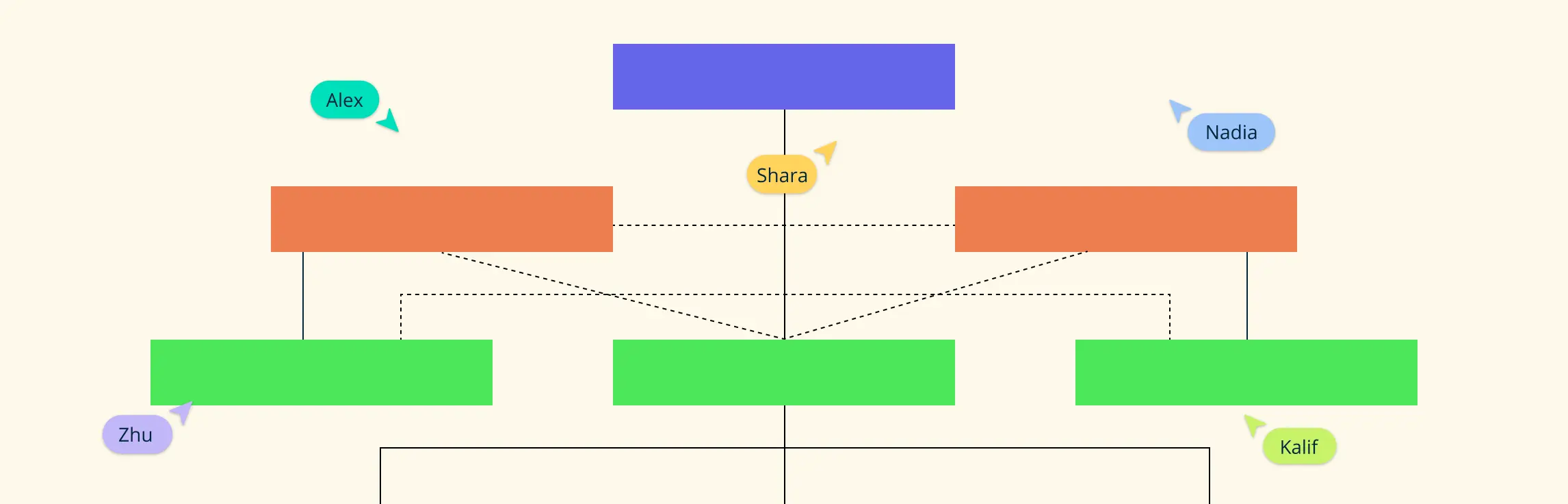
Working in today’s fast-moving business environment often means juggling competing priorities, collaborating across teams, and staying aligned even when everyone’s moving fast. That’s exactly why many organizations turn to the matrix structure. The matrix organizational structure gives teams the flexibility to work across functions while still keeping the stability of their core roles. And the easiest way to make sense of how it all comes together is through a clear, well-designed organizational chart for a matrix structure (matrix org chart). Once you see the chart, the entire system suddenly feels simpler—who works with whom, who supports which projects, and how decisions actually flow day to day.
Struggling with scattered workflows, unclear reporting lines, or overlapping responsibilities? Many growing organizations face the same challenge: as teams expand, keeping everyone aligned becomes a complex puzzle. A divisional structure can be the solution, breaking your company into focused, semi-independent units based on products, regions, or customer segments. In this guide, we’ll explore what a divisional structure is, its key features, practical examples, and how you can visualize your divisions with org charts using Creately, so your teams stay connected, accountable, and ready to move fast.
Building an organization without a clear structure often feels like juggling a dozen balls at once, teams overlap, responsibilities blur, and important tasks slip through the cracks. That’s where a functional structure comes in. By grouping employees based on their skills and responsibilities, a functional structure creates clarity, accountability, and efficiency. This guide will break down everything you need to know about functional structures, from their key characteristics, advantages, and disadvantages to real-world examples and ready-to-use functional structure org chart templates. By the end, you’ll have the insight and tools to design a structure that keeps your teams aligned, productive, and ready to scale.

The difference between functional and divisional structure isn’t just a theory in a business textbook — it’s a real decision that shapes how your team works every single day. Should you organize people by expertise, like marketing and finance, or build focused business units around products, regions, or customer segments? In this guide, we’ll compare how these two organizational charts actually operate inside companies, help you pick the model that fits your growth stage, and show practical ways to implement or transition without creating chaos.

A strong product organizational structure can make the difference between teams that thrive and products that stall. It’s more than a chart—it’s the backbone that aligns roles, responsibilities, and collaboration so your team can innovate faster, move smarter, and scale effectively. In this guide, we’ll explore models, roles, and best practices to help you build a structure that actually works for your products and people.
Choosing how your project team is organized isn’t a paperwork decision—it’s the difference between hitting your milestones smoothly or spending half your week untangling confusion over who owns what. If you’ve ever led a project where tasks bounced around like a hot potato, or watched brilliant specialists get sidelined because no one was sure who they reported to… you already know how much structure matters. Whether you’re scaling from a small startup to a multi-project operation, taking on a cross-department initiative, or rethinking how your PMO works, this guide will help you architect a structure that supports your goals, protects your talent, and delivers results consistently.

What is a Hierarchical Structure? The hierarchical organizational structure is a traditional model in which authority, responsibility, and communication flow through clearly defined levels, from top management down to individual contributors. Each employee reports to a single supervisor, creating a pyramid-shaped chain of command that supports control and accountability. This structure is one of the most widely used frameworks for organizing teams and business operations.
Ever felt lost in a tangle of dual reporting lines or overlapping project responsibilities? That’s the reality of many organizations, where employees often report to both functional managers and project leaders. A matrix organizational chart is the ultimate tool to cut through the confusion, offering a clear visual map of who reports to whom, which projects teams are working on, and how resources are allocated. In this guide, we’re sharing 10 practical matrix org chart examples that will help you simplify reporting lines, improve collaboration, and make your matrix organizational structure in project management work seamlessly.
What Is a Project Organization Chart A project organization chart is a simple visual map of your project team. It shows who is involved, what their roles are, and how they connect with each other. Think of it as the blueprint of your project’s people side—it makes responsibilities and reporting lines crystal clear.
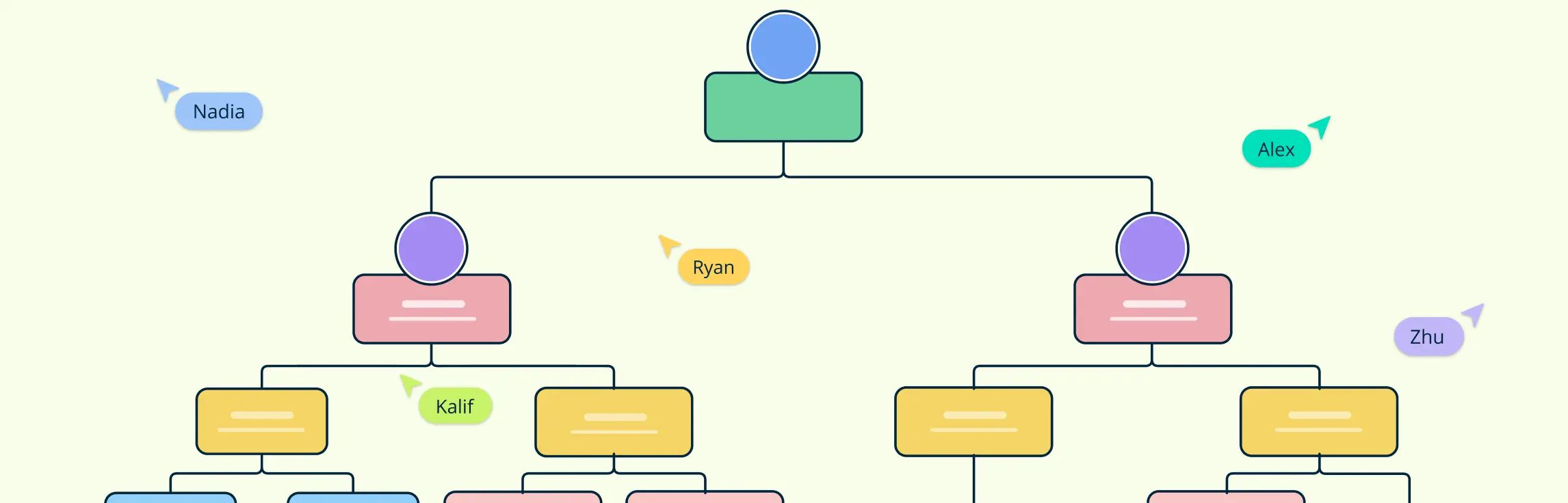
Ever stared at a company org chart and wondered what all those boxes, circles, and lines really mean? Those shapes aren’t just decorative. They’re powerful organizational chart symbols that communicate roles, responsibilities, and reporting relationships at a glance. From a single department to an entire corporation, knowing the org chart symbols’ meanings helps you visualize hierarchies, streamline workflows, and improve team collaboration. In this guide, we’ll break down the most common org chart icons, explain their uses, and share practical templates to help you create clear, professional organizational charts that everyone can understand.
An organizational chart helps your team see how everyone fits together and who reports to whom. It makes roles and responsibilities clear, improving communication and teamwork. This guide will show you simple steps to create an org chart that fits your business, plus tips and tools to make it easy to build and update.

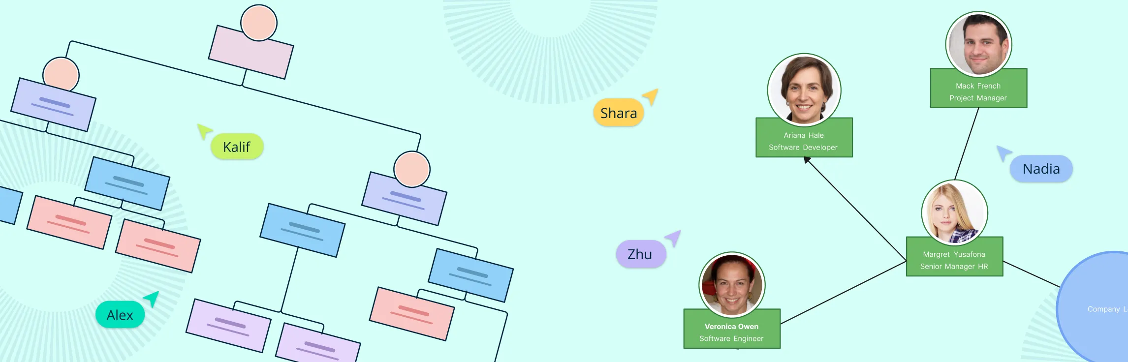
Organizational charts are powerful tools that help us understand how a company is set up and how people work together. In this guide, we’ll explore what an org chart is, its key parts, a bit of history, how it’s used, different types, the pros and cons, and real examples. Whether you’re creating one or just curious, this guide has you covered!
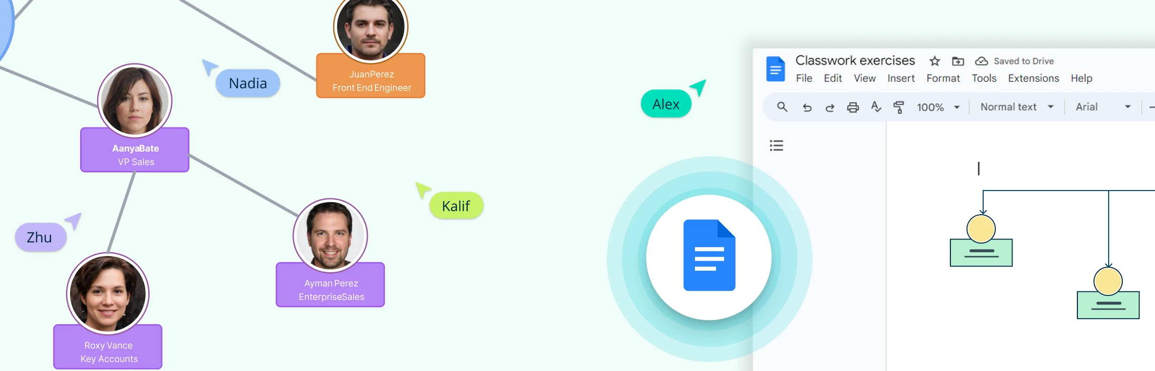
Creating an organizational chart in Google Docs is a handy way to visualize team structures and reporting lines, especially if you’re already working within Google Workspace. While Docs doesn’t have a built-in org chart feature, you can still build one using the Drawing tool with shapes and connectors. In this guide, we’ll walk you through the steps, share tips to make the process easier, highlight the drawbacks of using a Google Doc org chart, and suggest a better alternative for more complex or professional org charts.
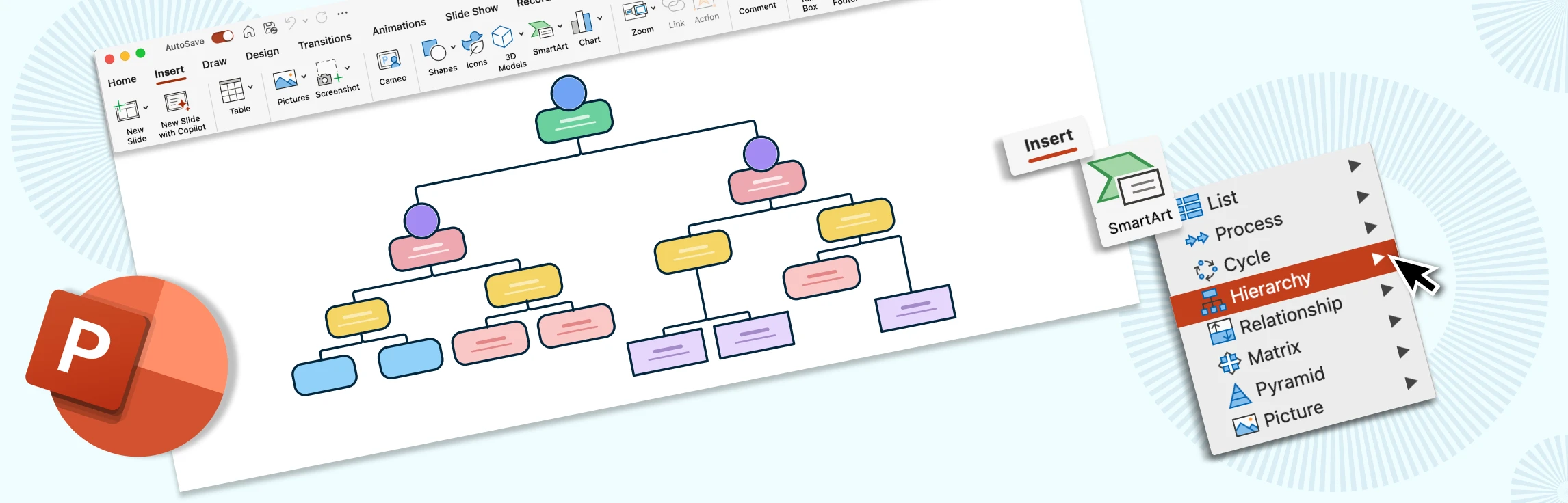
Creating an org chart in PowerPoint is a quick way to visualize reporting lines and align teams right inside your deck. This guide gives you step-by-step instructions on how to build an org chart in Powerpoint, practical layout and formatting tips to keep branches tidy and on brand, and common pitfalls to avoid. You’ll also get a clear view of PowerPoint’s limitations, and why a dedicated tool like Creately is better suited for creating professional organizational charts.
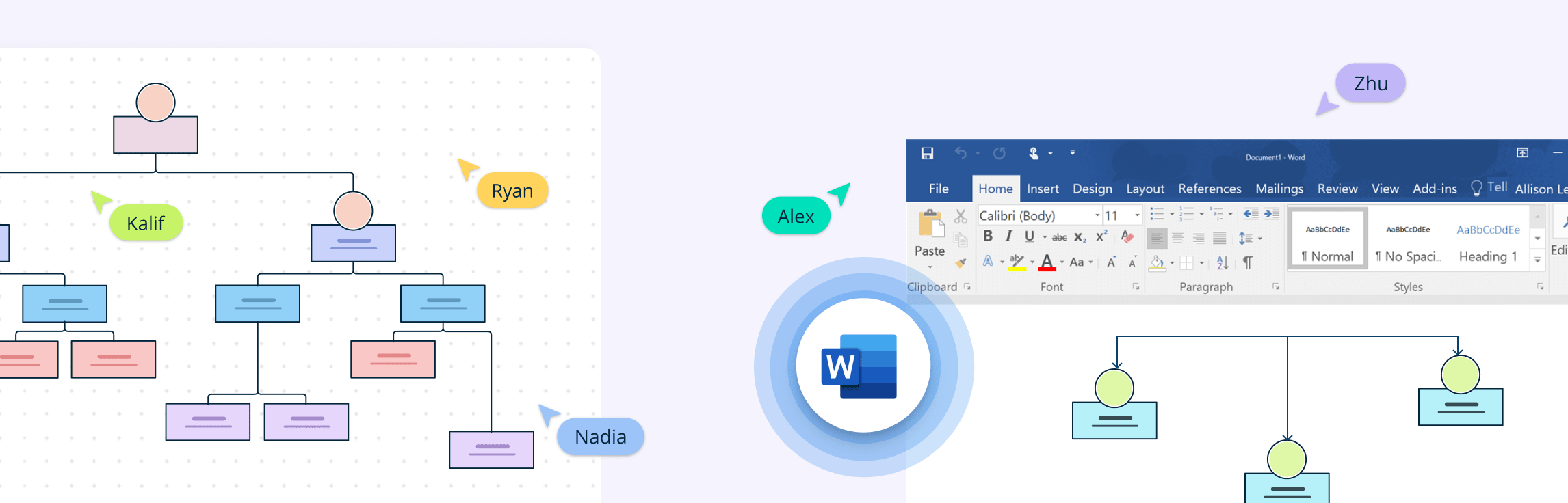
Creating an organizational chart in Microsoft Word is a quick way to visualize reporting structures and team hierarchies without needing specialized software. Whether you’re preparing a presentation, documenting your company structure, or sharing team roles, Word’s built-in SmartArt graphics make it possible to create a simple org chart directly within your document. In this guide, we’ll walk you through the steps, share tips to make the process smoother, point out Word’s limitations, and explore a better alternative if you need more flexibility.
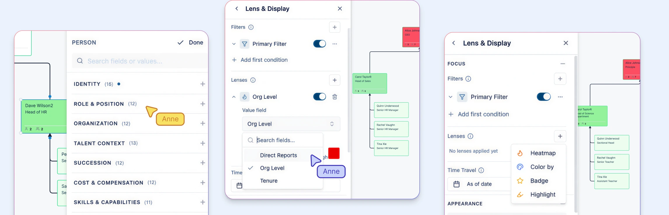
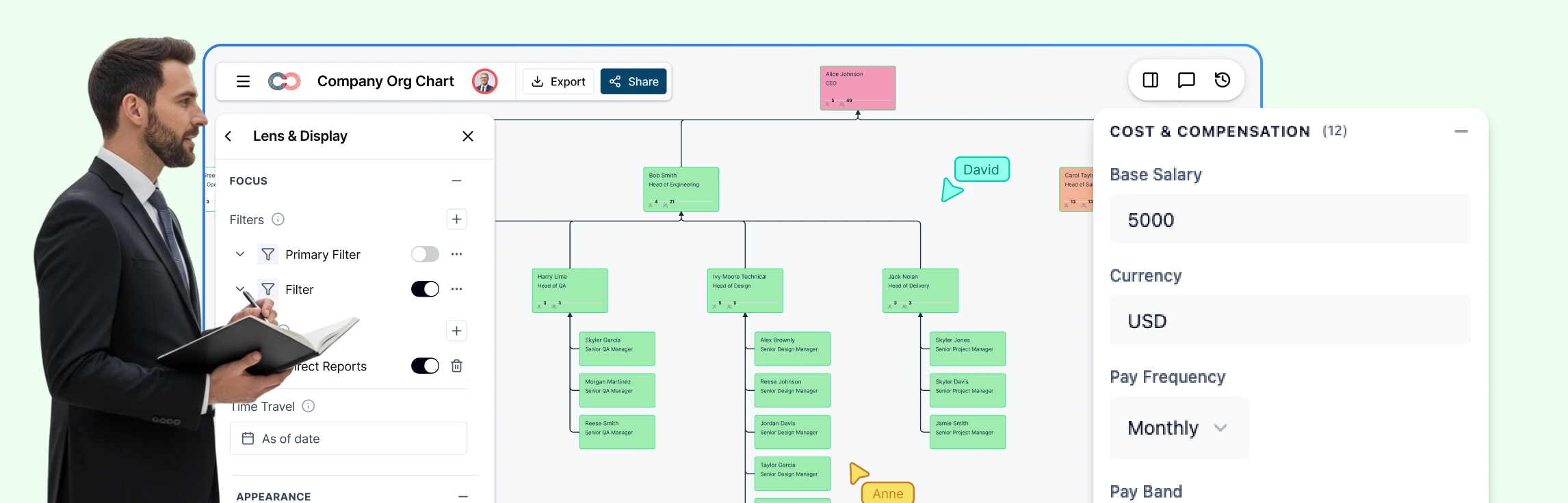
The shift toward data-driven decision-making is reshaping how companies visualize and manage their structures. By integrating real-time insights into organizational charts, businesses can unlock new efficiencies, enhance collaboration, and future-proof their strategies. In this guide, we explore the power of data-linked org charts and how they’re becoming indispensable tools for HR planning, strategy alignment, and organizational growth.
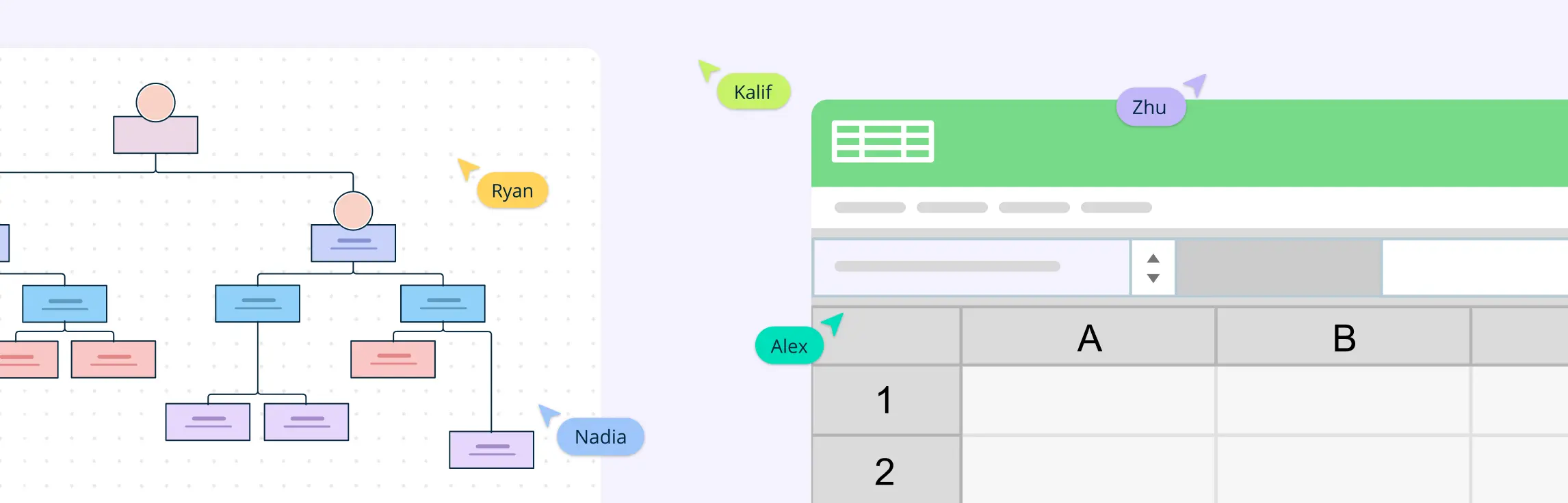
An Excel org chart is a visual representation of an organization’s structure created using Microsoft Excel. It outlines the relationships between different roles, departments, and individuals within a company. In this guide, we’ll show you how to make an org chart in Excel and explore the benefits of using Creately, a tool designed to overcome the challenges Excel presents.

An organization chart is a graphical representation of relationships between an organization’s departments, functions, and people. It can also indicate the flow of data, responsibility, and reporting from bottom-up or top-down. Its usage across the globe is a testament to its effectiveness. Below are some rules for drawing organizational charts and org chart best practices to make your org chart more meaningful and useful.